

Design comparison

Community feedback
- @VCaramesPosted about 2 years ago
Hey there!👋 Here are some suggestions to help improve your code:
-
The background color is incorrect (unless if you did this on purpose).
-
To center you content to your page, add the following to your Body Element:
body { min-height: 100vh; display: grid; place-content: center; }-
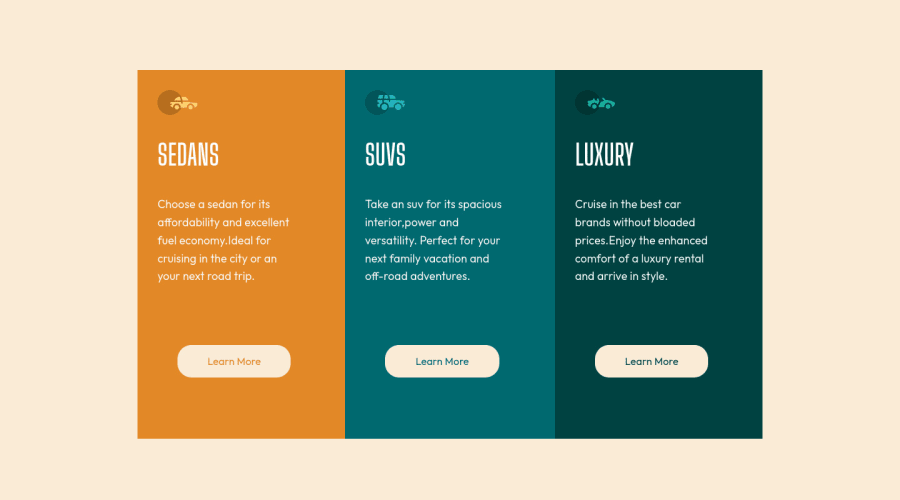
The car images/icons in this component are purely decorative; They add no value. So their Alt Tag should left blank and have an aria-hidden=“true” to hides them from assistive technology.
-
Your "buttons" were created with the incorrect element. When the user clicks on the button they should directed to a different part of you site. The Anchor Tag will achieve this.
-
The button styling is incorrect; it should be a solid white.
-
Your buttons need to have
cursor: pointer,:hoverand:focus-visible.
If you have any questions or need further clarification, let me know.
Happy Coding! 👻🎃
Marked as helpful1@akshaykumarmondalPosted about 2 years ago@vcarames Thanks comrade!! cursor: pointer, :hover and :focus-visible ---> I did not get this one.
0 -
- @correlucasPosted about 2 years ago
👾Hello @akshaykumarmondal, Congratulations on completing this challenge!
Great code and great solution! I’ve few suggestions for you that you can consider adding to your code:
- The html structure entirely with
div blocksbut these div doesn't any semantic meaning, for this reason is better you use a better html markup improving your code, for example for each vehicle card you use<article>instead of the<div>. - The icon doesn’t have an important role when you think about semantics and the html structure. So you can add
aria-hidden=“true”to avoid it being found and read in the accessibility mode/screen readers. These are only decorative items. - Think about using relative units as
remoreminstead ofpxto improve your performance by resizing fonts between different screens and devices. Anyhow, if we want a more accessible website, then we should use rem instead of px. REM does not just apply to font size, but to all sizes as well.
✌️ I hope this helps you and happy coding!
Marked as helpful1 - The html structure entirely with


Please log in to post a comment
Log in with GitHubJoin our Discord community
Join thousands of Frontend Mentor community members taking the challenges, sharing resources, helping each other, and chatting about all things front-end!
Join our Discord