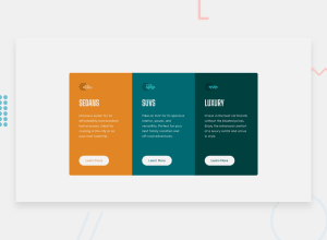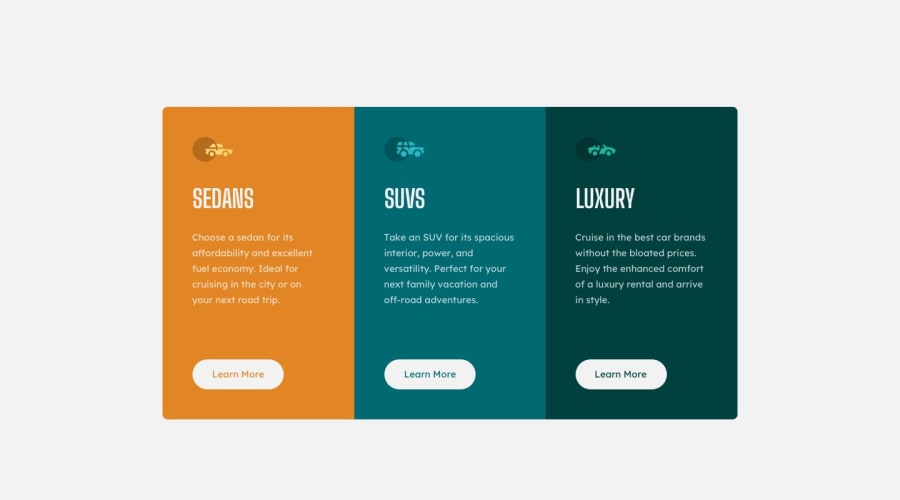
Design comparison
SolutionDesign
Solution retrospective
I do not think anything is wrong with the code, but any feedback is still appreciated!
Community feedback
- @elidrissidevPosted about 3 years ago
Hey there! Great job with this one, you've made it look very close to the design. I noticed some points that you can improve in your solution:
- Every page can have at max one
h1, you have used 3. Consider replacing them byh2. If you wanna take it one step further, you can include anh1but make it visually hidden since it's not in the design to make it only readable by screen readers. - You've made the heading of every card all uppercase. While that's how it looks in the design, making them all uppercase in your html means screen readers will interpret them as an abbreviation (i.e. they will spell it word-by-word). To fix this, you should write them in normal casing in the html and add a
text-transform: uppercaseto the headings. - This one is a minor detail: You can avoid having to set
border-radiuson the first and last card by setting it on their parent. After doing this you'll see the corners still sharp so to fix it you need to addoverflow: hiddento clip the edges of the cards sticking out.
This is all I have, I hope it was helpful. Good luck to you!
Marked as helpful0@PresidentTreePosted about 3 years ago@elidrissidev Thank you for the feedback! All the changes have been made!
1@elidrissidevPosted about 3 years ago@PresidentTree I checked them. Well done!
0 - Every page can have at max one
Please log in to post a comment
Log in with GitHubJoin our Discord community
Join thousands of Frontend Mentor community members taking the challenges, sharing resources, helping each other, and chatting about all things front-end!
Join our Discord
