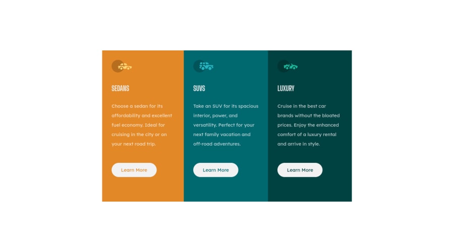
Design comparison
Solution retrospective
Feedbacks are welcome!!!
Community feedback
- @madanlalitPosted about 2 years ago
No border radius given otherwise its good!
Marked as helpful0 - @QuellerisPosted about 2 years ago
Hello, I'd recommend not setting a defined height for the container. When making the screen smaller it causes the content to break outside of the container. Instead, use min-height or max-height to set element's height and allow it to grow or shrink if necessary. The same goes for width. Instead of width, use min-width or max-width.
Use rem units instead of vw for setting width, it will cause the component to behave better.
also minor thing, but you didn't add background-color to body and border-radius to the container.
happy coding.
Marked as helpful0
Please log in to post a comment
Log in with GitHubJoin our Discord community
Join thousands of Frontend Mentor community members taking the challenges, sharing resources, helping each other, and chatting about all things front-end!
Join our Discord
