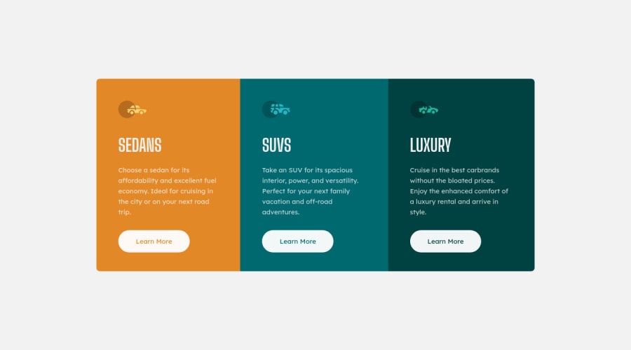
Design comparison
Solution retrospective
I'm open to suggestions for improvement
Community feedback
- @AleromsPosted over 2 years ago
Hi Dario,
Congratulation on completing this challenge. Your solution looks great. I have some suggestions regarding your solution if you don’t mind:
-
it looks like you have multiple
<h1>. it is recommended not to have more than one h1 on the page. Multiple <h1>tags make using screen readers more difficult, decreasing your site’s accessibility. -
it seems that you did not include a hover effect on the buttons. You can get the effect by adding
a:hover { background-color: transparent; color: $transparent-white; border: $transparent-white 2px solid; }This will make the <a> as the design has it. I would also add a
2px solidon the <a> This way when the hover on <a> , it doesn't add an additional 2 pixels to the height and width making the elements shift.Cheers!
Marked as helpful2@frozmehPosted over 2 years ago@Aleroms hi Santiago! About using multiple h1 was a mistake on my part, I was going to use h2 instead. Thanks for the button suggestion :)
0@AleromsPosted over 2 years ago@frozmeh I understand that completely! I made that same mistake too because I was copying and pasting the card.
0 -
Please log in to post a comment
Log in with GitHubJoin our Discord community
Join thousands of Frontend Mentor community members taking the challenges, sharing resources, helping each other, and chatting about all things front-end!
Join our Discord
