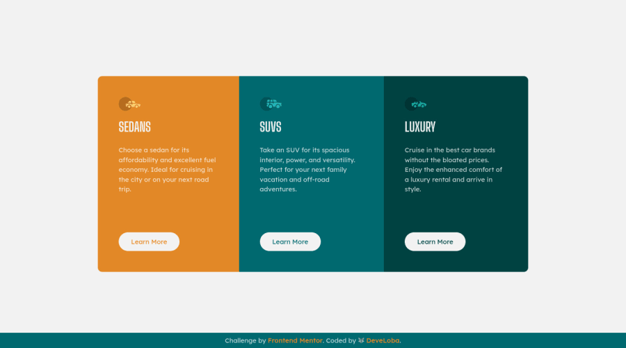
Column card preview [HTML and CSS] using pseudo elements
Design comparison
Solution retrospective
I did not have any main issues to code this challenge. I practiced the use of pseudo classes in this challenge. For this, I used pseudo element ::before to add the icon of each card, and I used pseudo elements to select each card and apply separated styles.
However, I tried to keep clean CSS rules and repeat styles as little as possible. Please leave any comment to improve my code!
Community feedback
- @VCaramesPosted about 2 years ago
Hey there! 👋 Here are some suggestions to help improve your code:
-
The purpose of the Main Element is to identify the main content off your page; It is not the container of you component. Inside the Main Element, you will want to create a new container and place your component inside that new container.
-
The headings in your component are being used incorrectly. Since the <h1> Heading can only be used once, it is always given to the heading with the highest level of importance. This component has three headings of equal importance, so the best option would be to use an <h2> Heading, since it is reusable and it will give each heading the same level of importance.
If you have any questions or need further clarification, feel free to reach out to me.
Happy Coding! 🍂🦃
Marked as helpful0 -
Please log in to post a comment
Log in with GitHubJoin our Discord community
Join thousands of Frontend Mentor community members taking the challenges, sharing resources, helping each other, and chatting about all things front-end!
Join our Discord
