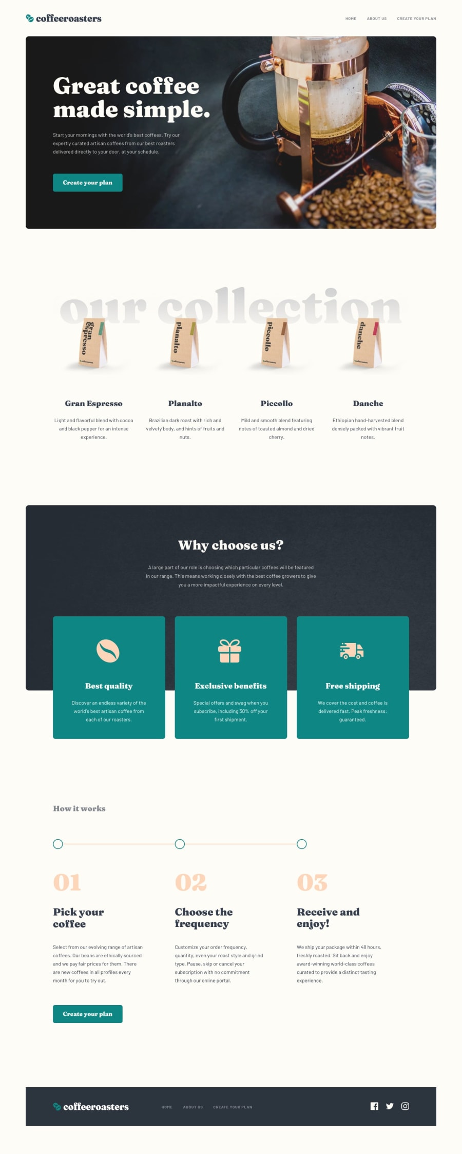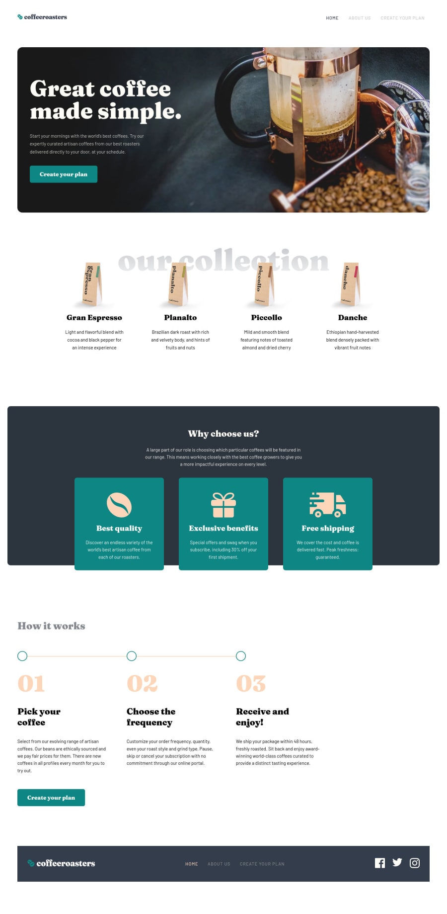
Design comparison
Solution retrospective
-
What is your preferred way to handle responsive images? I've used three different types (see the readme) and I think I prefer the <picture> method. Maybe there is a better way I didn't use yet.
-
Any remarks on how I structured my Vue Components are more than welcome as well.
-
Anyone who knows how to fill svgs without inline
<svg>
: you can be my hero if you tell me.
Do feel free do drop a comment on anything you like or think can be improved!
For my own record: I have been working on this little number for a few days on and off now. I think it took me about 24 working hours in total.
Community feedback
- @tedikoPosted over 3 years ago
Hello, Joran Minjon! 👋 Congrats on finishing another challenge! Your solution looks very good and also responds well. Here's my few tips:
- I'd personally add some
max-width
on the container and center it horizontally so the content of the page doesn't look too stretched on large screens. - Change the
alt
attributes for the.coffee__image
,.usp__icon
, as they don't add any extra context for screen reader users. Since your images are decorative youralt
text should be provided empty (alt="") so that they can be ignored by assistive technologies. Headings below these images describe content, no need to keep those alt attributes. - I believe your footer social icons are lacking anchor tags.
- You can
fill
your svg using css property which is named exactly the same. All you have to do is give class to svg/path that you want to style. - Add
:focus
pseudo class to interactive elements like anchors, buttons etc. Useoutline
property to make your website more accessible to keyboard users. Focusable elements like anchor, buttons or inputs they have applied default:focus
pseudo class withoutline
property. These default styles are subtle and hardly visible tho. Furthermore every browser has a slightly different default style for the outline, so you probably want to change the default style. Read more about why we should change focus styles.
Good luck with that, have fun coding! 💪
2@palgrammingPosted over 3 years agoI have not tried this yet but it looks promising for the SVG issues https://css-tricks.com/svg-loader-a-different-way-to-work-with-external-svg/
also so far your challenge looks like you have a good start going but on the About Us page the margins around the locations might need some work at desktop size
1@DrKlonkPosted over 3 years ago@tediko Thank you for your thorough reply!
SVGs
On the fill elements: I found that that only works on inline svg elements. This can make the html quite verbose, quite rapidly. Inside of an
<img>
tag, the fill property does not work.I've implemented the option that @palgramming suggested and it seems to work for external icons, but not for local ones.
Other points
Thanks for the pointers! I think I fixed it all.
I've fixed the first with a sticky (instead of fixed) menu, and a
max-width
andmargin: 0 auto
on the container.1 - I'd personally add some
Please log in to post a comment
Log in with GitHubJoin our Discord community
Join thousands of Frontend Mentor community members taking the challenges, sharing resources, helping each other, and chatting about all things front-end!
Join our Discord