


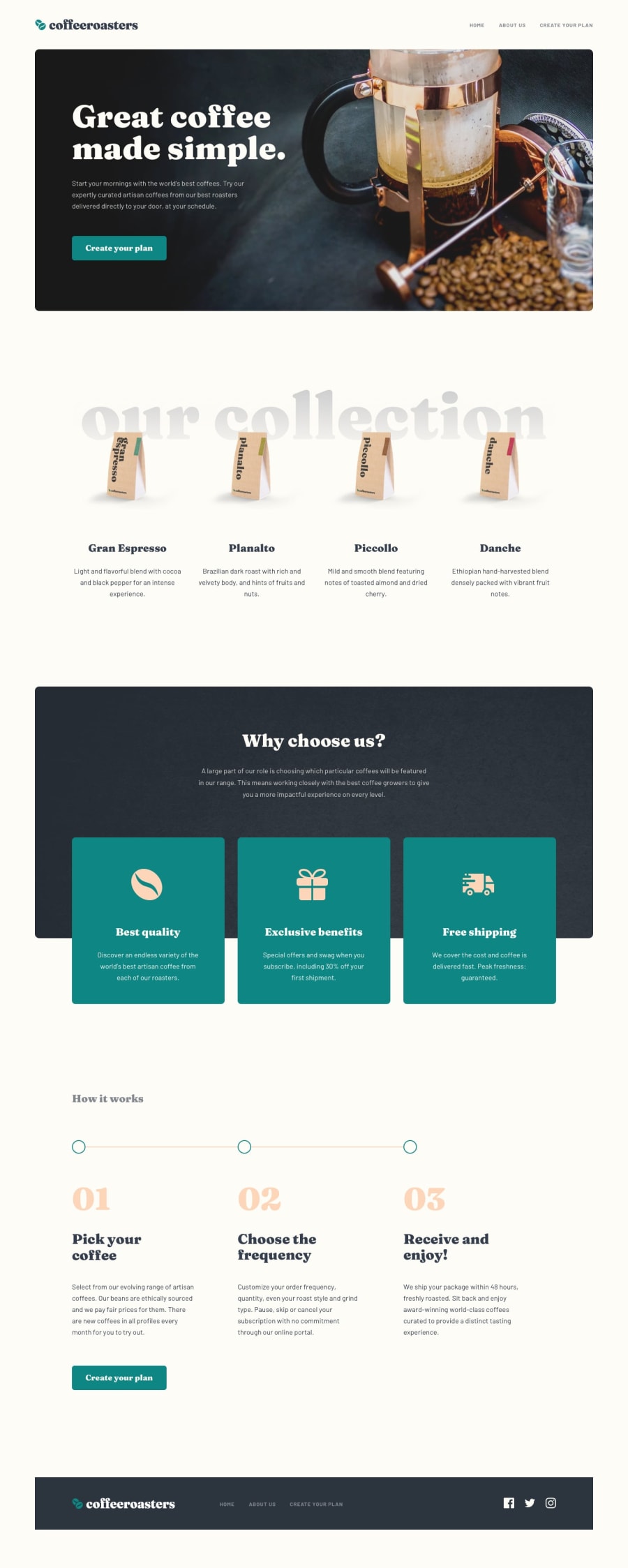
Design comparison
Solution retrospective
Hi here is my solution for Coffeeroasters-subscription-site. I used HTML, CSS, JS.
What challenges did you encounter, and how did you overcome them?It was to enable or disable some of the selection depending on the input, making a website with different pages and keep a good responsiveness depending on the page.
And validate the form using :
What specific areas of your project would you like help with?document.querySelector('input[name="howYouDrink"]:checked');
Feel free to leave any comments.
Thanks.
Community feedback
- @dar-juPosted about 1 month ago
Hi Lo-Deck!
You did a great job! The task is quite large and you did it very carefully. The js logic works correctly, the site is semantically laid out perfectly.
I tried to study it carefully.
- for all hovers and focuses, add transition, it greatly enlivens the interaction with the page and the page becomes much more attractive. For example, for
.li-navaddtransition: color ease-in-out 0.3s;and so on for all hovers - when you fill out the form and click "Create my plan" the pop-up window pops up not where I am, but at the top of the page, I have to scroll, it's inconvenient. Make the window position fixed and center it:
position: fixed; top: 50%; left: 50%; transform: translate(-50%, -50%);- the site should be more responsive. Look at the screen resolution of 765px and around - the content is too narrow and inconvenient to view. It is better not to limit the width of the blocks, but to add indents on the sides, for example, 50px, and remove them for mobile layout.
- it is convenient when the logo has a link to the main page
- it would be ideal to make the next part open when selecting a form item. Otherwise, I did not immediately understand what to do) And it is better with animation, so that it is clear that this is the next step.
Everything else is cool, good luck with the development!
Marked as helpful1P@Lo-DeckPosted about 1 month ago@dar-ju Hi thanks for your tips and your comments, it helps me to improve my work.
It's true I set a size for mobile and then my first breakpoint is set at 768px, it may be a bit smaller for those who have a screen just below this size.
And I find this to add to my JS :
window.scrollTo(0, 0);to have the page go to top for the modal box.1 - for all hovers and focuses, add transition, it greatly enlivens the interaction with the page and the page becomes much more attractive. For example, for


Please log in to post a comment
Log in with GitHub
Join our Discord community
Join thousands of Frontend Mentor community members taking the challenges, sharing resources, helping each other, and chatting about all things front-end!
Join our Discord