Coffeeroasters subscription site with React and Styled-components
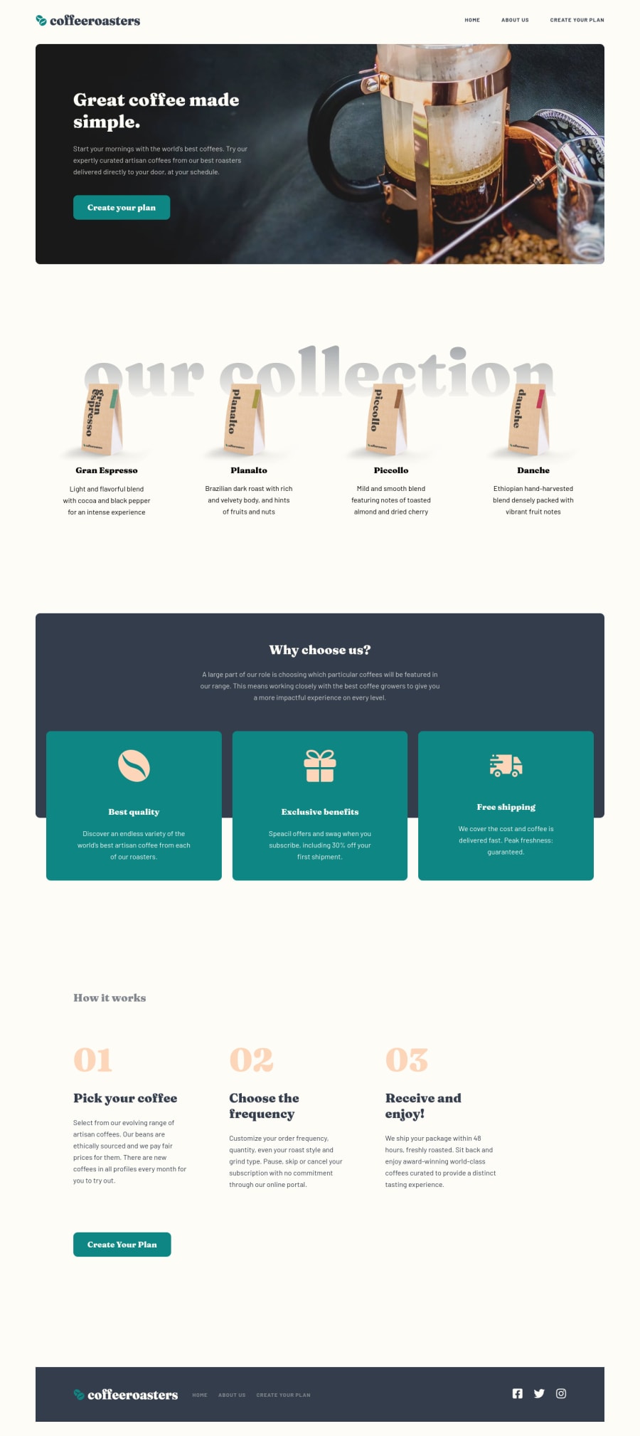
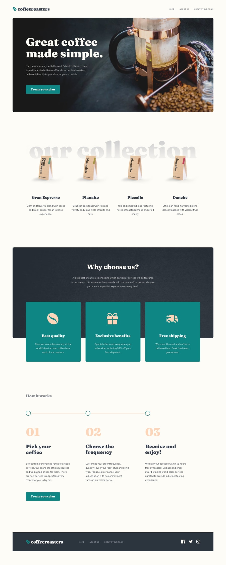
Design comparison
Solution retrospective
Happy with the result here even though I didn't quite complete all design features. In particular I wasn't able to figure out the decorative horizontal rule that is present in larger screens in the "How it works" section.
Fairly happy with how I organized components and styles. The logic and state management got a little messy for the order form section. Looking for feedback on how I could have maintained state cleaner or just wrote cleaner code for that section.
Cheers!
Please log in to post a comment
Log in with GitHubCommunity feedback
No feedback yet. Be the first to give feedback on Jimmy Sweeney's solution.
Join our Discord community
Join thousands of Frontend Mentor community members taking the challenges, sharing resources, helping each other, and chatting about all things front-end!
Join our Discord
