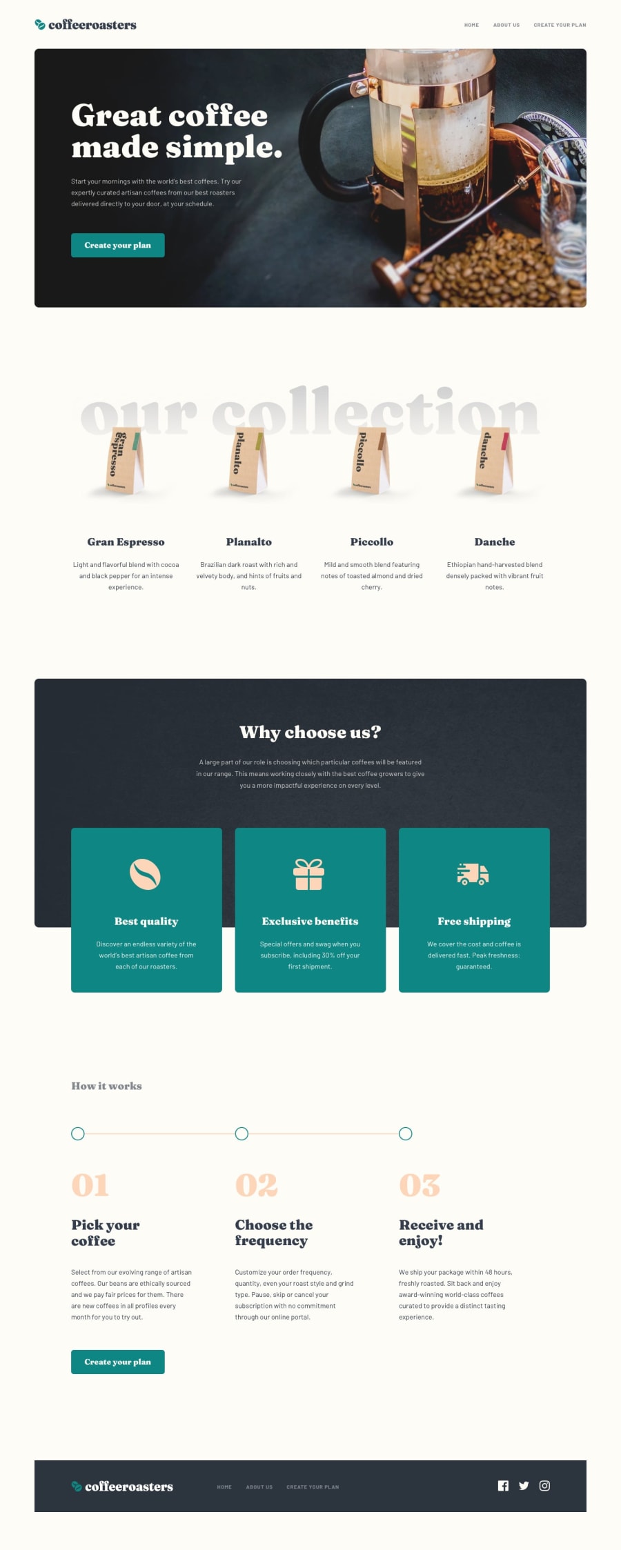
Design comparison
Solution retrospective
Hey everyone!
I just completed another challenge. 🤘🏽
Feedback is always welcome. Please let me know of any issues you may find and/or how I can improve my code :)
Happy coding!
Community feedback
- @elaineleungPosted about 2 years ago
Hi Stephjoseph, this looks really nice actually, and it's too bad the screenshot doesn't do it justice! I suggest that you can try commenting out the animations when you submit your solution and then uncomment them once the screenshot is taken, otherwise it can be hard to compare the original when the screenshot doesn't show the site.
About the animations, I like what you did in "create your plan", and I think the animation there is really effective, and that's the main content of the site, in that, this is what the company wants to sell. For the other things like the offices and headquarters, I don't think they are as important, and I would use animation very sparingly for these parts. To use animation more effectively, I actually would choose to have fewer animations, and I advise you to just really think about which elements you want to highlight most. Animation is most effective when the key elements "pop" instead of every element.
That's all the feedback I have; I think this was just well done on the whole!
Marked as helpful1@stephmunezPosted about 2 years agoHello Elaine, hope you are well. Thanks for the feedback :)
Nice idea on commenting out the animations, never thought of it. Will take another screenshot in a bit.
Got you, those are great points to learn from. Would definitely save me some time and from a little bit of headache haha
Once again thanks for the kind words!
0
Please log in to post a comment
Log in with GitHubJoin our Discord community
Join thousands of Frontend Mentor community members taking the challenges, sharing resources, helping each other, and chatting about all things front-end!
Join our Discord
