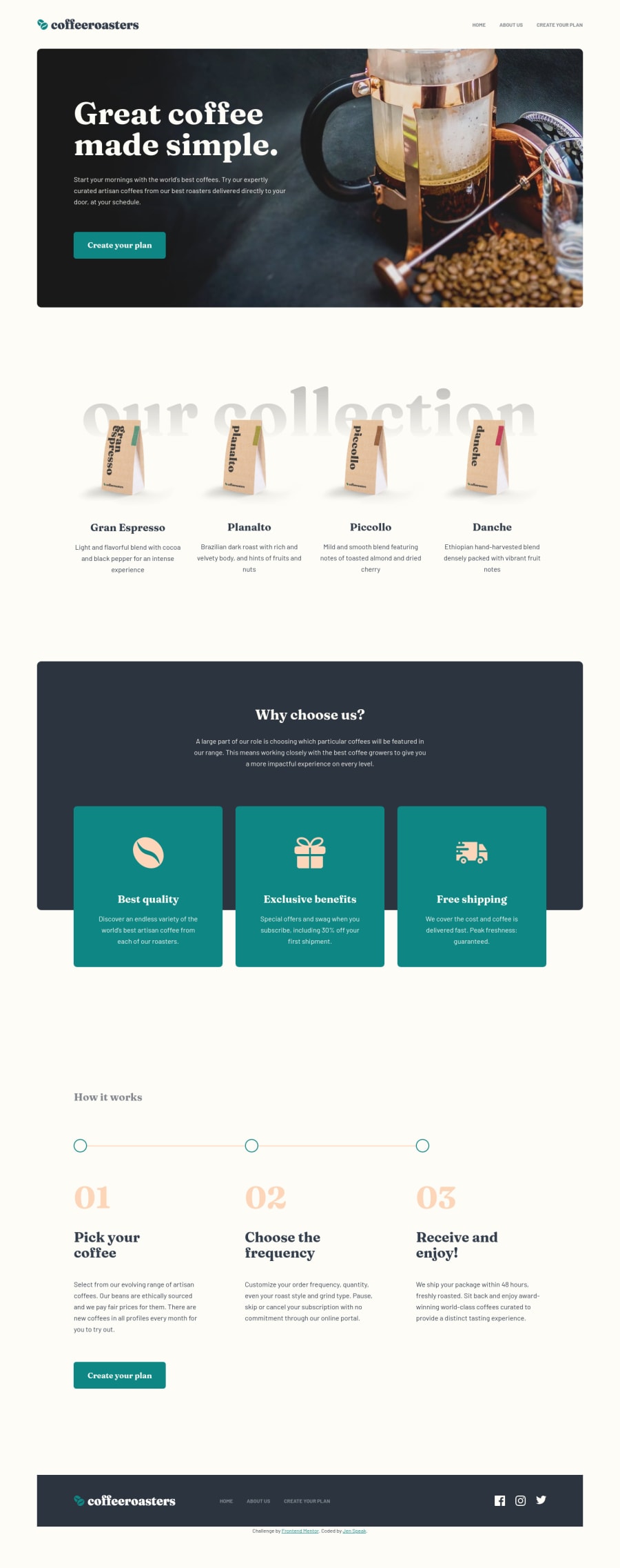
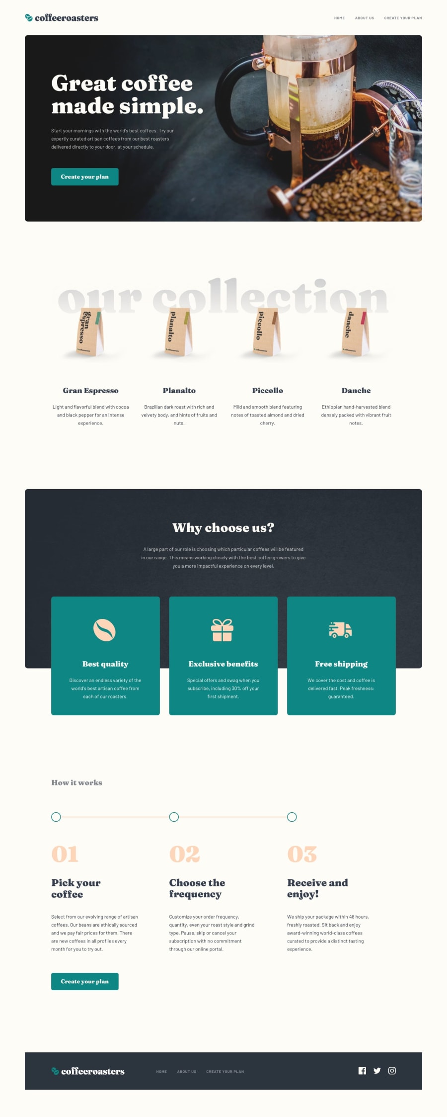
Coffeeroasters Subscription Site | React | Styled Components | a11y


Design comparison
Solution retrospective
I would love feedback on this challenge! This is my first multi-page challenge and I am still fairly new to React, therefore any React-related feedback would be highly appreciated. What do you think of the file structure and the way the code is organized? Am I splitting up my components appropriately? How is my use of styled-components? This is also my first challenge where I tried to focus a lot on best accessibility practices. Please let me know about accessibility areas I could improve on.
I wrote a detailed README for this project so feel free to check that out, but I'll just summarize a few of the things I implemented:
- a skip link
- smooth scroll animation
- a sticky Sidebar in the plan page (only on laptop breakpoint and up)
- a responsive Spacer component to add whitespace between components instead of using margins
Community feedback
Please log in to post a comment
Log in with GitHubJoin our Discord community
Join thousands of Frontend Mentor community members taking the challenges, sharing resources, helping each other, and chatting about all things front-end!
Join our Discord