Submitted almost 2 years ago
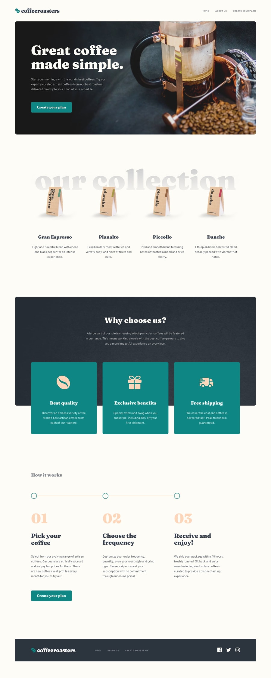
CoffeeRoasters, a large and complex project that looks great finished
@jefcooper
Design comparison
SolutionDesign
Solution retrospective
This project turned out well. The design is fantastic and I love the look of this challenge when it is finished. The color scheme is attractive and sophisticated.
This challenge is difficult because of the number of changes at each breakpoint. I think in a commercial project, I would work with the designer to have a consistent font hierarchy so there aren't so many small adjustments in each section of each page.
Community feedback
Please log in to post a comment
Log in with GitHubJoin our Discord community
Join thousands of Frontend Mentor community members taking the challenges, sharing resources, helping each other, and chatting about all things front-end!
Join our Discord
