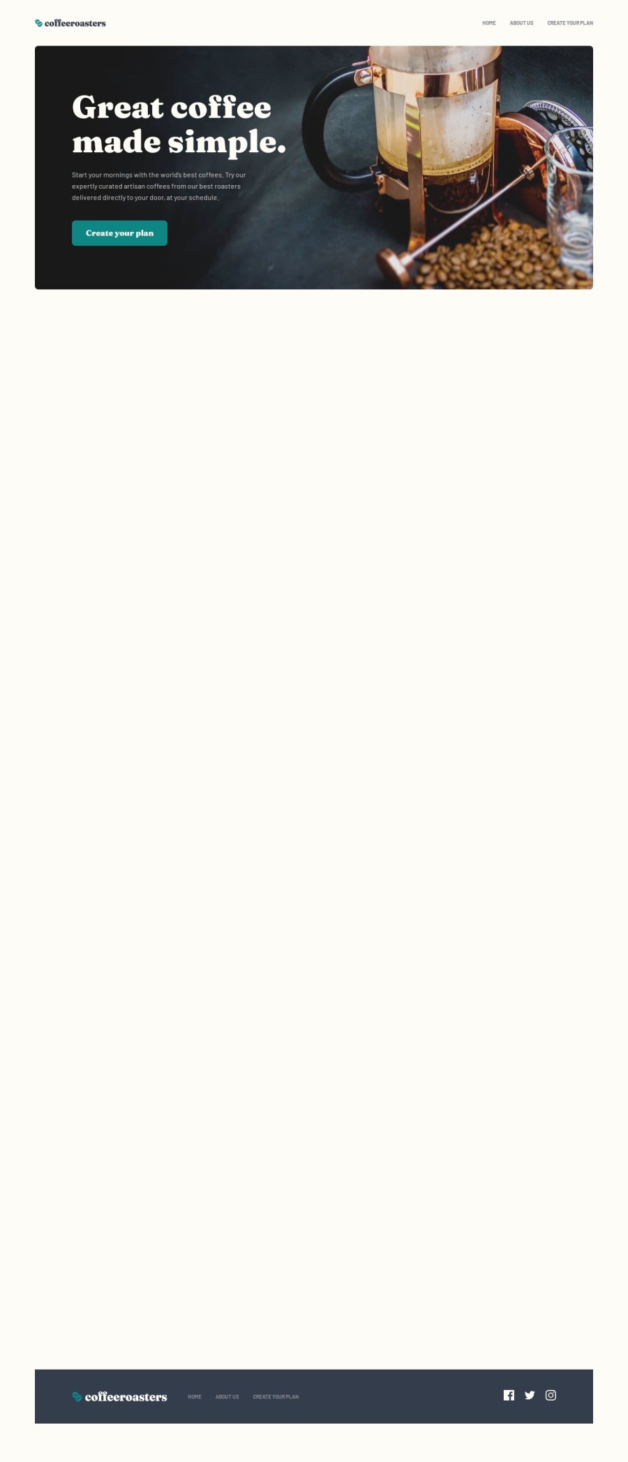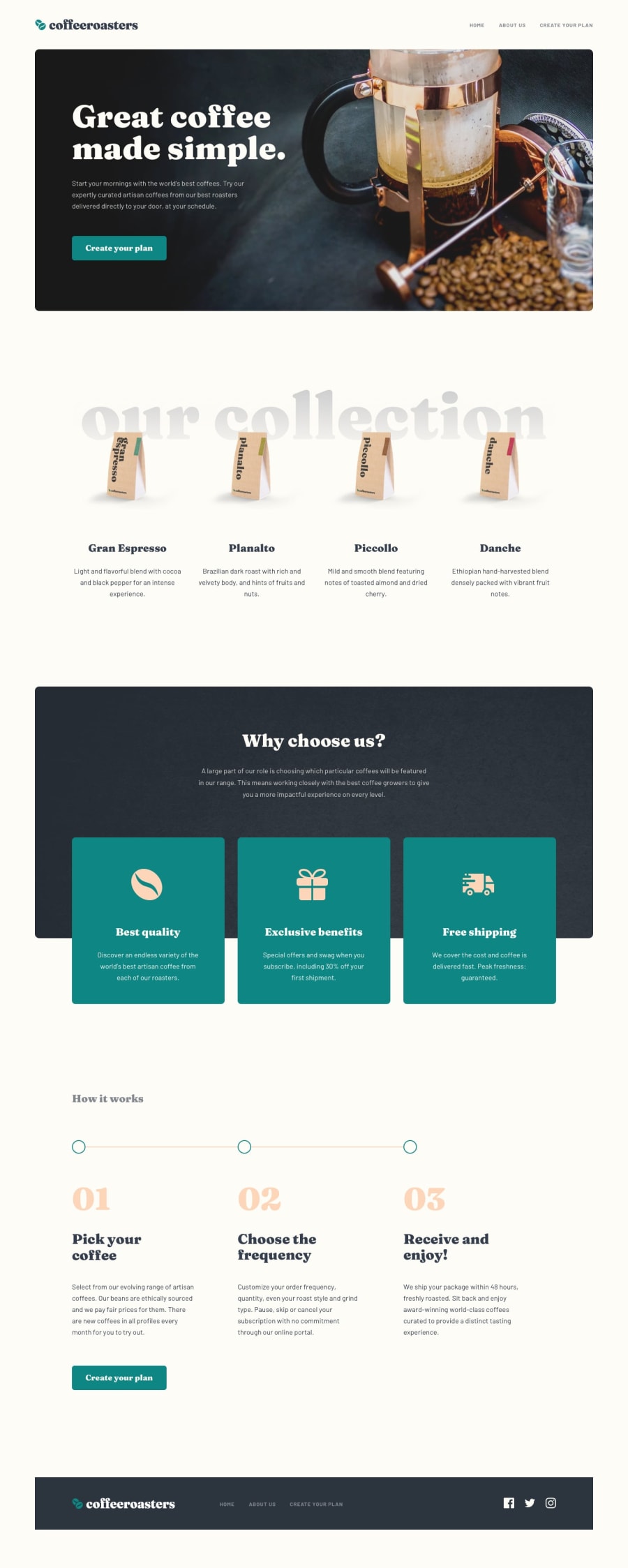
Coffeeroasters subscription page (Html, Css(Sass, BEM), Js)
Design comparison
Solution retrospective
I'm happy to have done this challenge because it really helped me in trying to understand how to best organize a multi-page website in various aspects, and gave me more confidence in facing challenges like this.
In the future I would like to continue creating *challenges of this type, trying to add further customizations during development.
What challenges did you encounter, and how did you overcome them?The challenges I had to face in this challenge are related to the "main" component, i.e. the accordion, as I had to manage various aspects and exceptions, including the fact that the data was linked to other components of the page;
Overall this design aspect was very useful.
What specific areas of your project would you like help with?In general I would appreciate feedback regarding the work done, but specifically feedback regarding the code relating to the management of the accordion and the related parts would be of great help to me (summary, dialog ).
Many thanks in advance ;)
Community feedback
Please log in to post a comment
Log in with GitHubJoin our Discord community
Join thousands of Frontend Mentor community members taking the challenges, sharing resources, helping each other, and chatting about all things front-end!
Join our Discord
