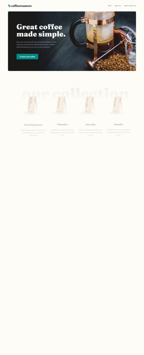
Coffee-roasters Multi-page website (Next.js)

Solution retrospective
🎁 Features:
Achieved 95% in Lighthouse score for performance, 91% accessibility, 100% best practices, and 100%SEO. 📊
Responsive design 📱💻
CSS Modules to packages my styles.
🎨 Clean codebase and formatted using VS Code formatter. 💻
Framer motion 🖌️
🛠️ Built With:
Next.js 13. ⚡
Semantic HTML5 markup 📑
CSS custom properties 💎
Flexbox 🖌️
CSS Grid 🖌️
Mobile-first workflow📱
Let me know if you have any feedback, I would love to improve my solution 😊🤝
What challenges did you encounter, and how did you overcome them?I didn't read the requirements for the "create your plan" section, so I underestimate the complexity of it. I solve that by reading the requirements and did a little refresher course on React and how to manage state between differents components.
One thing I didn't solve is on the "about us" page. The image in the section "Uncompromising quality" is supposed to be overflowing half of its height on mobile and tablet and some rem on desktop. But I wasn't able to do it and manage properly the distance with the text under and the distance with the section before.
What specific areas of your project would you like help with?I would love help on the "about us" page and more precisely on the section with the title "Uncompromising quality". The image is supposed to be overflowing half of its height on mobile and tablet. I don't know how to do it properly so the distance with the text under is always the same. Same for the distance with the section before it.
Please log in to post a comment
Log in with GitHubCommunity feedback
No feedback yet. Be the first to give feedback on André-Lubin Thomas's solution.
Join our Discord community
Join thousands of Frontend Mentor community members taking the challenges, sharing resources, helping each other, and chatting about all things front-end!
Join our Discord