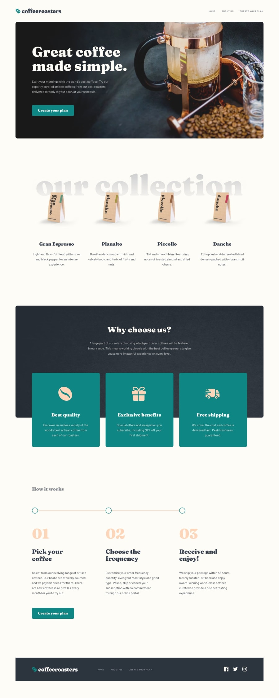
Design comparison
Solution retrospective
I do know I did not add the collapsible sections for creating a plan, but other than that, I'd like some suggestions on how I could of modularized better. I feel like I had to keep going over work and re-doing things due to not structuring better. Any other feedback is welcome!
Community feedback
- @haryor745Posted over 3 years ago
Hi Joseph! Its pretty good although there are some minor differences from the original its still good I have a question though, how long did it take you to complete it? I made with React [see here] (https://coffeeroasterz.netlify.app/) and it took me about 3 days so I'm tryna check if using frameworks actually save any time Thanks and happy coding!🤩
0@Joelynn94Posted over 3 years ago@haryor745 Thanks for the feedback! I do know the margins and padding seem to be off in certain spots. I spent 22 hours actually coding the project (over about a week). Yours looks great! I noticed that the "Our Collection" heading on mine is cutting off and yours is not, I'll have to see what you did differently there.
0
Please log in to post a comment
Log in with GitHubJoin our Discord community
Join thousands of Frontend Mentor community members taking the challenges, sharing resources, helping each other, and chatting about all things front-end!
Join our Discord
