Coffeeroaster Multi Page | Next.js , Mobile first
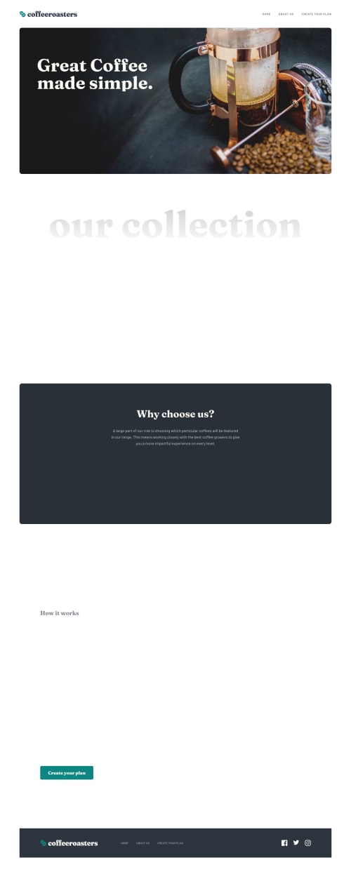
Design comparison
Solution retrospective
Hello. This is my 24th challenge here and my first premium challenge taken^^
This challenge was taken around January but took me too long to build it. January and early February was really hectic as again, lots of school activities/projects and even short film animations, those was grouping so that I had to shift my focus for it at the time! Glad that it was over. Phew:>>
I picked this challenge as a first out of the premium challenges because this challenge was the one that I really want to create when I saw way before the challenges here at fem and i'm really glad that I was able to take this one!!
This is my first time using styled-component as well. I haven't searched articles about what is the proper approach or convention when using styled-components. That is why for every styled-component that I used, I prefixed it with a "Styled" word like "StyledNavbavList", I was thinking that it is too verbose and kind of felt a bit off at first but I just continued with it. It will be really nice if you share your thoughts about using styled-components, specially naming each styled.
I added some animations as well on the site and I think I got the functionalities right? Hehe, hoping so. For the create-plan page, I initially thought that there will be no logic in the price computation, the moment when I had to push now the site, I saw a readme on the challenge folder from the challenge.zip, there it was. The logic for the computation :>>> That was close submitting a not fully functional site!!
Lastly, if you could give me a resource/information on how to render svg dynamically. For example, I have 3 svgs in a folder, how can I just import that and use it without using the svg as a value for src prop in the img. Thanks!
(The hover for the social media icons was supposed to make it colored paleOrange but never did it because I want to render svg dynamically and not manually adding svg code if there is such a way)
Overall, I am really happy with this one and hoping that I could not tackle more challenges. Thank you for checking this one out!!
Community feedback
- @vanzasetiaPosted over 2 years ago
Hi, Raymart! π
Congratulations on finishing this challenge! Nice work on this challenge! π
It looks good on both my mobile and desktop devices. Good job! π
Some feedback:
- I notice that the About Us page doesn't contain any
h1
. I would recommend making the About Us as ah1
. - Usually, the logo is wrapped with a link that will navigate the user to the home page. I would suggest doing that.
- I try your website in
prefers-reduced-motion
and I still see the animation when I scroll and the transition on hover. I would expect that there will be no animation and transition. - I also try to see the site when the JavaScript is disabled and as a result, I only see content in
footer
andheader
. The text content inside themain
element is gone. I would recommend having anoscript
that will tell the user to enable JavaScript.
I hope this helps! Keep up the good work! π
Marked as helpful1@pikapikamartPosted over 2 years ago@vanzasetia Hi Vanza! Glad that you liked the site!
For the feedbacks:
- Glad that you noticed that one!! I mistakenly assume that I used the same component for each of the hero section of the page to hold the h1 text, but used a different one of the about us page. I was confused at this at first since the h1 text on the design is not same for each one so I had to use other stylings for the about page. Thanks for this!
- For the logo part, I intended that one to not be on a link since the
home
link is already present on the navbar. Whenever I have a navlink that contains the homepage link, I don't wrap the logo in a link to avoid a duplicatearia-current="page"
being announced 2 times when traversing links :>> - Apparently, framer-motion, the animation library that I used doesn't really removed all animations even if the user toggles the system's animation, the libray will still add the
opacity
transition for each one of the component. I search about this one and apparently there are no other workaround. I'm still thinking if I want to use a library again on other projects because I can't really control them compared to just using my own code. But hey, that you mentioned this one since I misspelled myprefers-reduced-motion
toprefers-reduce-motion
!! - Lastly for the content, like what I mentioned, can't control the library since it uses javascript to show those animations, but in terms of seo or using assistive-tech, the contents are still there, just hidden visually. Haven't added a
noscript
text on this one as well since I don't have any good reason to actually first think of user disabling their javascript except for like pop-ups or ads right. But thanks for this bit as well..
Thanks again Vanza!
1@vanzasetiaPosted over 2 years ago@pikapikamart You're welcome! Glad to help! π
About disabling JavaScript, usually, the users that disable JavaScript are the users that don't want to be tracked. For example, whenever I need to visit a site that has a lot of trackers or ads like the news sites, I like to disable JavaScript. That way, I don't need to see any annoying ads pop-up.
In this case, of course, I have no reason to see your site without JavaScript. It's just something that I want to mention. π
2 - I notice that the About Us page doesn't contain any
- @mattstuddertPosted over 2 years ago
Great to see you post a solution for your first premium challenge, Raymart! β¨
Your project looks fantastic, and I love the extra details like the animations and the sticky header. Great to see you add the
prefers-reduce-motion
query as well for those who prefer not to see animations.I'd recommend reviewing your implementation of the "Create plan" page with keyboard navigation in mind. I couldn't choose individual options as it always focused on the group when tabbing through the content. I could use the arrow keys, but I'd expect to be able to tab through the options easily and select one using space or enter, which I wasn't able to do.
I'd recommend adding the
name
attribute to your radio inputs as well so that they're grouped appropriately.I hope that helps. Keep up the excellent work! π
Marked as helpful1@pikapikamartPosted over 2 years ago@mattstuddert Hi Matt! Glad that you liked the site!
For the create plan page, I don't know about this one since the groupings, those options bellow the buttons are set of radios and the expected navigation on them will be to use arrow keys since you can only select one.
For the
name
attribute, glad that you pointed that one out Matt! It is my idea to not add thename
attribute at first because I wasn't going to use the native form to destructure the value for each of the radio-group since I was using a controlled radio and changing the state for every change of radio hence adding theonChange
for each one and also as long as radio inputs are group by a container, they will function the same with using keyboards and screen-reader as I tested with nvda but not sure with talkback since talkback don't have support for telling where a radio is group, it's really weird.Thanks again on this one Matt, going to add the
name
since it is the proper way!0 - @ChamuMutezvaPosted over 2 years ago
Amazing work Raymart, well done. It maybe an issue with my cellphone, there is a section which is remaining blank when I scroll - will post you the images on slack
Marked as helpful1@pikapikamartPosted over 2 years ago@ChamuMutezva Hi Chamu! Thanks again for mentioning about it and sending it in slack. The issue should be fixed by now, it was because of the
whileInView
property for a parent container from framer.I instead just added a custom hook to check for visibility so that it won't have to rely on that property and it will let the child component to animate if they are in view now. Thanks again!!
1 - @denieldenPosted over 2 years ago
Hi Raymart, you did a great job!
I assign a descriptive name as if it were a class together with the tag that I am going to stylize, for example for a container
div
I call itDivContainer
. Using Styled at the beginning I find it superfluous, once you see the tag followed by the pseudo description you can understand that it is nothing more than a styled component :)What do you think about it?
Hope this help and happy coding!
Marked as helpful1@pikapikamartPosted over 2 years ago@denielden Hey Deniel!
I also make use of that convention as well, like treating those container just like that I would do with scss using bem convention and I find that at first my end naming convention but then since I was using styled, I could just create any naming right and I ended up making my naming to verbose :>>>
Do you follow a convention when using styled-component? Do you have like a resource about that? Perhaps a link on what you follow?
Trying to see how others go with it and maybe adapting one for myself. Thanks again!
2@denieldenPosted over 2 years ago@pikapikamart I don't use any conventions other than trying to make it as clear as possible that it's a stylized component to anyone reading the code.
You can see an example in the code of this my solution
0@pikapikamartPosted over 2 years ago@denielden I see, so you like generalized the naming of the styled for each component. For example, you don't name the styled as the same name of the component since it will be only used on that one.
I saw like
ContainerDiv
Table
they are generalized since they will be used by the component itself and doesn't need extra naming.Thank you again on this!
2 - @Sdann26Posted over 2 years ago
You have an incredible result, congratulations.
1 - @imhayatunnabiPosted over 2 years ago
nice
1 - @fayax555Posted over 2 years ago
You could prefix with an
S
instead ofStyled
. SoStyledNavbar
will becomeSNavbar
.1@pikapikamartPosted over 2 years ago@fayax555 I was thinking about that and I did at first as well, but I don't know why I don't like seeing 2 capital letter side-by-side like
SN
fromSNavbar
hahahaha. But hey, thank you for this!0
Please log in to post a comment
Log in with GitHubJoin our Discord community
Join thousands of Frontend Mentor community members taking the challenges, sharing resources, helping each other, and chatting about all things front-end!
Join our Discord