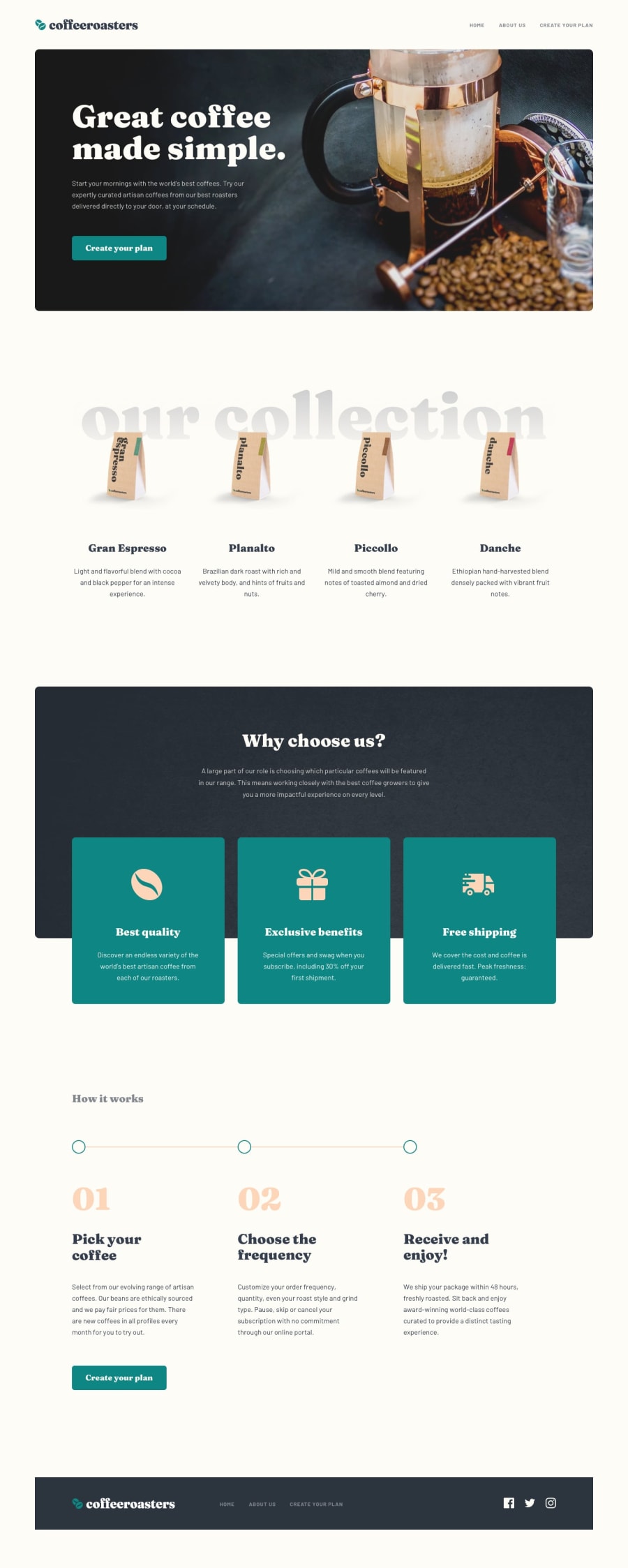
Design comparison
Solution retrospective
What are you most proud of, and what would you do differently next time?
Creating my first website with Tailwind was an exciting journey. I'm quite proud of how it turned out, especially since I learned a lot on the go. The responsive design was particularly challenging, but I managed to figure out some useful techniques. Incorporating animations using Framer Motion was also a highlight.
Next time, I would focus more on planning the design system within Tailwind. Ensuring that all responsive font sizes are pre-defined would streamline the process significantly.
What challenges did you encounter, and how did you overcome them?What challenges did you encounter, and how did you overcome them?
Working with the form section presented some difficulties. Initially, I struggled with managing React states. Here’s what I learned:
- React retains the previous state, affecting form selection. Implementing a useEffect hooked into the state helps keep everything up-to-date.
- Tailwind is straightforward once you dedicate time to setting up brand colors and fonts. Investing time in this step from the beginning is crucial for a smoother experience next time.
All feedback is welcome!
Community feedback
Please log in to post a comment
Log in with GitHubJoin our Discord community
Join thousands of Frontend Mentor community members taking the challenges, sharing resources, helping each other, and chatting about all things front-end!
Join our Discord
