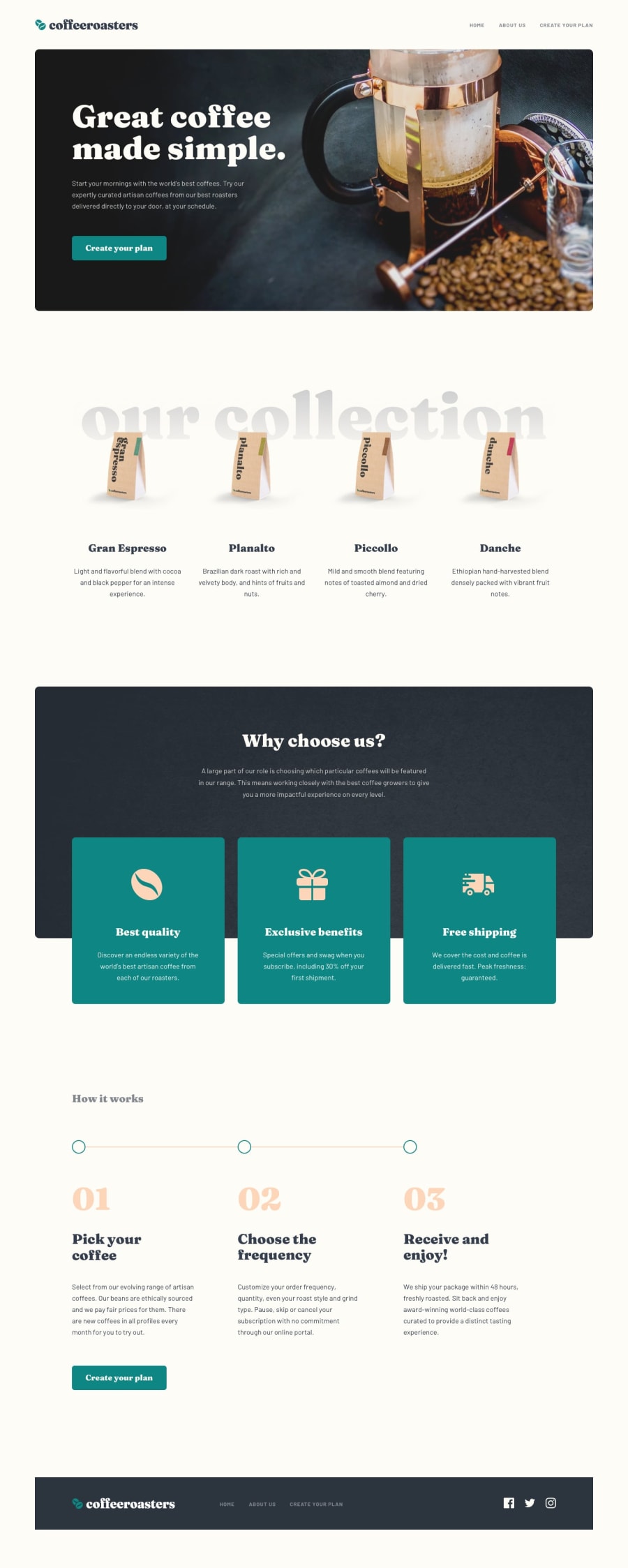
Design comparison
SolutionDesign
Solution retrospective
Although I am happy with the way things turned out, I bit off more than I could chew with this project, as the JS that was required for the subscription page was a little much for me. I did add the JS for the nav and modal. With that said, I enjoyed the challenge of this project and will revisit it after more learning. Also, after reading through the feedback from other members projects, this will be the last project that I will use px for font size.
Community feedback
Please log in to post a comment
Log in with GitHubJoin our Discord community
Join thousands of Frontend Mentor community members taking the challenges, sharing resources, helping each other, and chatting about all things front-end!
Join our Discord
