Design comparison
Community feedback
- @En-JenPosted over 3 years ago
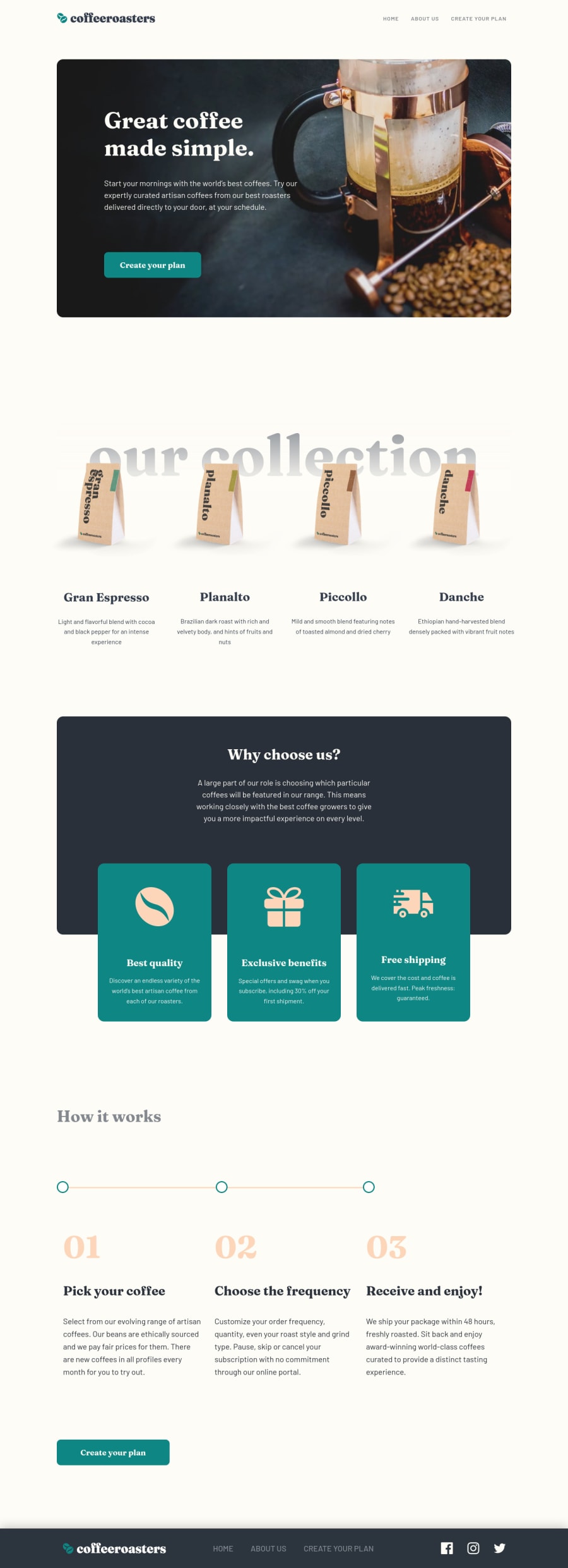
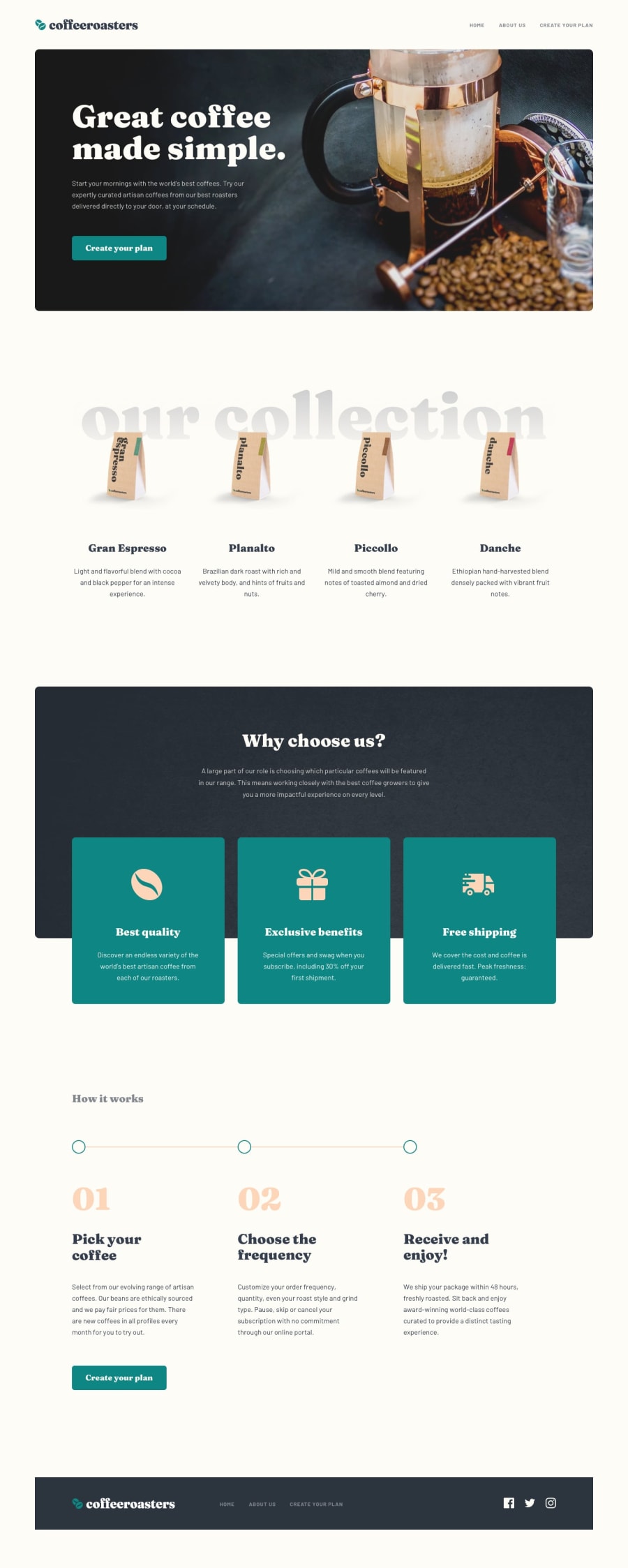
Hey there, just came to check out your solution to this challenge after seeing that you left feedback on mine 😊 Really nice job on it! I love the little coffee cup favicon you included and the order summary message before the user selects any options. The detailed README is also really nice to see 👏 One thing I noticed is a bug when the user doesn't select the coffee subscription options in the order that they appear on the plan page. I tried selecting them out of order and then even when I had made a selection for every question, the button to open up the modal was still disabled. Something I would consider doing for future projects is to break up your scss into more files (organized by page, components, etc.) so that you don't have over 1000 lines of code in one big scss file. Overall you did a really nice job on this challenge! Keep up the good work 💪
-Jen
1@ospopPosted over 3 years ago@En-Jen Thanks for pointing that out, it is fixed now. Regarding the css, I find it confusing sometimes when I'm spreading reused components on multiple partials because I forget where I put them, so I start cutting and pasting from one partial to another and then I end up with one large file and few smaller files. I'll keep this in mind though for the next challenges and figure out a way to manage them better. I might start adding some multi-lines separators as you do. Anyways, happy coding!
1
Please log in to post a comment
Log in with GitHubJoin our Discord community
Join thousands of Frontend Mentor community members taking the challenges, sharing resources, helping each other, and chatting about all things front-end!
Join our Discord
