Design comparison
Solution retrospective
i would appreciate any helpful feedback
Community feedback
- @JeuriMorelPosted almost 4 years ago
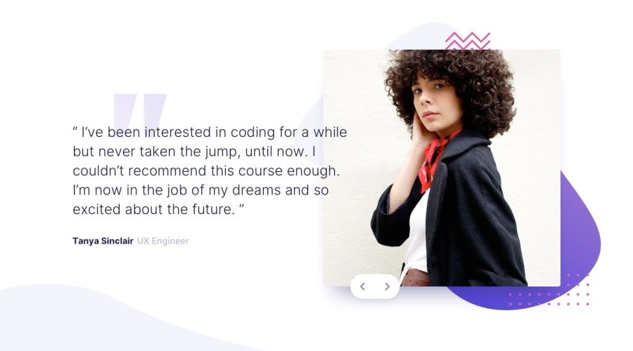
Hi. I've found a few issues mainly having to do with responsiveness. Firstly, the image doesn't stay centered on all mobile devices. As the devices get wider, width is added to the space on the right of the image instead of both sides. It's not just on mobile; on desktop, up until around 1025px the image is tucked on the top left corner. Also, from around 500px width to around 800px width, the quote paragraph starts moving down the page (and behind the bottom wavy background image) until it disappears completely. This lasts for around 200px. Another thing, and I almost missed this when I myself was doing this design, is that you're supposed to make it so that the user can switch between slides using the keyboard as well.
Marked as helpful1
Please log in to post a comment
Log in with GitHubJoin our Discord community
Join thousands of Frontend Mentor community members taking the challenges, sharing resources, helping each other, and chatting about all things front-end!
Join our Discord
