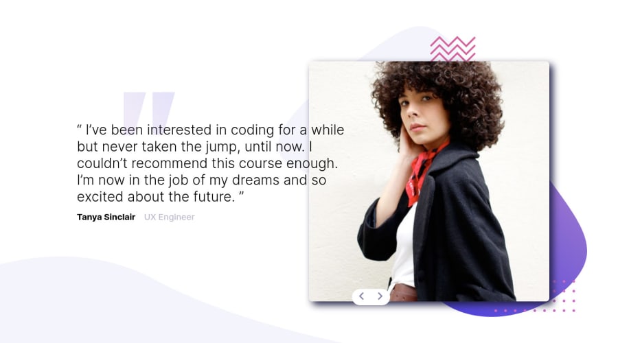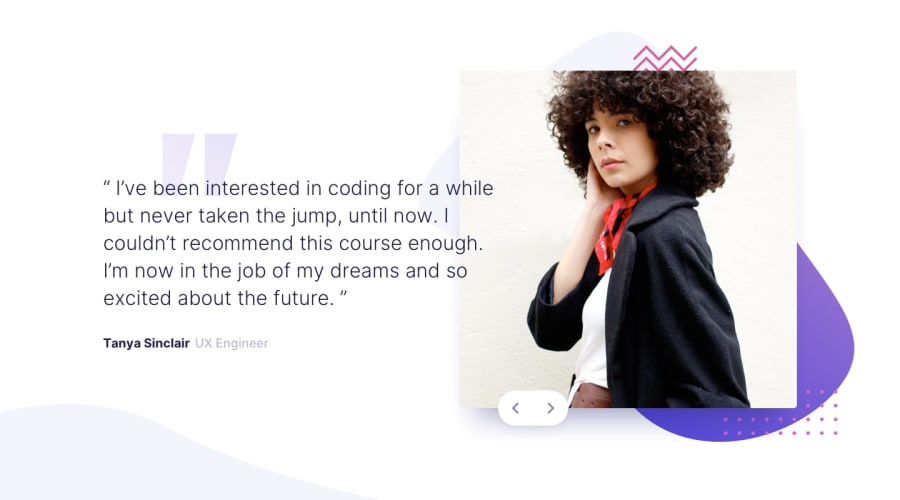
Design comparison
SolutionDesign
Solution retrospective
Hello everyone! Any feedback is welcome and appreciated! Happy coding all!
Community feedback
- @KrzysztofLeczyckiPosted almost 3 years ago
This fancy animation after page loading looks cool. :D Desktop version looks quite good; however, you could correct buttons alignment. Your mobile needs improvement:
- there are some problems with paddings/margins,
- the background should be better aligned,
- portraits aren't responsive.
I suggest not using
!importantdue to avoiding inheritance issues in CSS. See MDN article. Best wishes. :D
Marked as helpful1@BurakOzcancfPosted almost 3 years ago@KrzysztofLeczycki Oh thanks for your important feedbacks. I will consider and improve! I will check it again. Appreciated 🙏🏻
0
Please log in to post a comment
Log in with GitHubJoin our Discord community
Join thousands of Frontend Mentor community members taking the challenges, sharing resources, helping each other, and chatting about all things front-end!
Join our Discord
