Design comparison
SolutionDesign
Solution retrospective
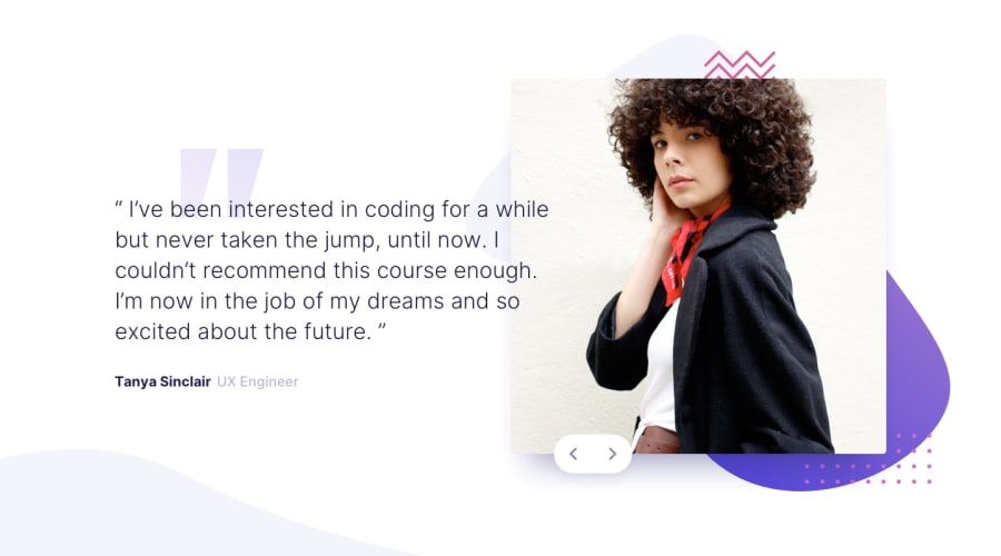
Hello. In this challenge, I used js to populate the html content of the testimonials.
I've had a bit of trouble placing the buttons so they're positioned correctly when the screen resizes. I ended up using: position: relative + change top\left with different media queries. If you know the best way to place the button so that it stays in the same place for different screen widths and heights, so as not to position it relative to the picture and not to place it inside the picture block - let me know, please.
Thank you!
Community feedback
Please log in to post a comment
Log in with GitHubJoin our Discord community
Join thousands of Frontend Mentor community members taking the challenges, sharing resources, helping each other, and chatting about all things front-end!
Join our Discord

