coding-bootcamp-testimonials-page with basic CSS and jQuery
Design comparison
Solution retrospective
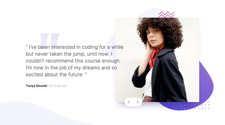
Would really appreciate some feedback on how the medium-size layout can be styled better! Also looking for advice on better designing the fading effects applied.
Community feedback
- @mattstuddertPosted over 4 years ago
Awesome work on this challenge! The medium-sized screens are always the hardest I find. At a large mobile size, the blue pattern is overlapping the text, making it hard to read. I'd definitely recommend resolving that as it reduces the legibility of the text which is bad for accessibility. When the content goes to a two-column layout the text looks quite squashed and the image is quite large. I'd recommend reducing the image width and increasing the text width.
I hope that helps. You've done a really good job!
0
Please log in to post a comment
Log in with GitHubJoin our Discord community
Join thousands of Frontend Mentor community members taking the challenges, sharing resources, helping each other, and chatting about all things front-end!
Join our Discord
