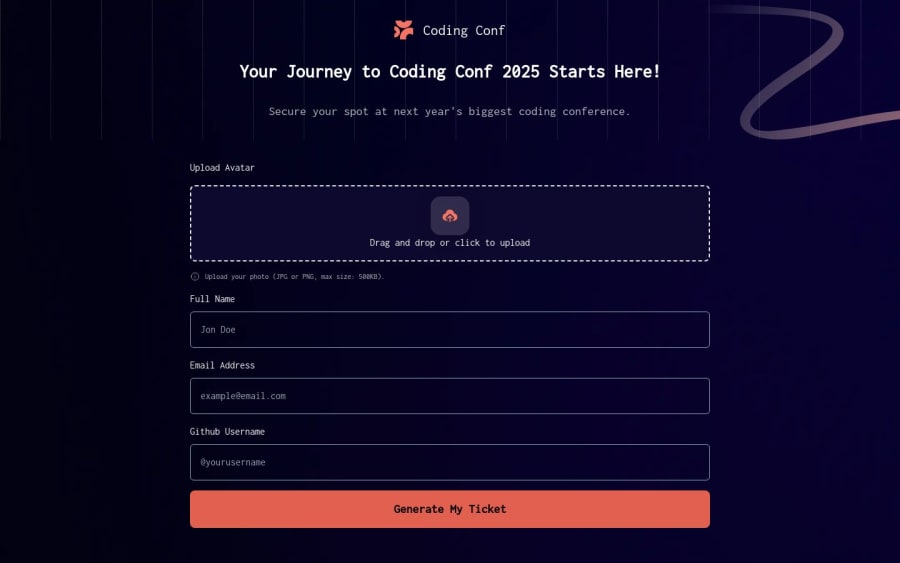


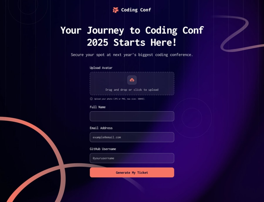
Design comparison
SolutionDesign
Community feedback
- @khatri2002Posted 4 months ago
Hi! The developed solution looks great!
However, please note that the form fields do not occupy 100% width on desktop devices, as specified in the design reference.
Additionally, ensure that hover and focus styles are applied to the inputs and button for a more polished user experience.
Great work so far! Happy Coding!
1

Please log in to post a comment
Log in with GitHubJoin our Discord community
Join thousands of Frontend Mentor community members taking the challenges, sharing resources, helping each other, and chatting about all things front-end!
Join our Discord