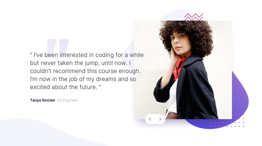
Design comparison
Solution retrospective
Hello Front-End Mentor Community! I'm Daniel and this is my solution for this challenge! 😊
🛠️ Built with:
- HTML 🧾
- Vanilla CSS
- JavaScript 🤖
- Swiper JS 🆕
- Mobile first workflow approach 📲
Nice opportunity to practice using the Swiper JS library. I feel that I haven't made the best decisions on this project when it comes to responsiveness, but I was able to deliver all the requested funcionalities. I've used a little Javascript to make it possible passing the slides using the keyboard left and right arrows.
I also added my own slide with a message about how good I think this platform is. ✅
Anyway, it took me a few hours to finish, but I enjoyed every minute of it.
Again, thanks to the Front-End Mentor team that creates challenges that make us learn a lot from doing them. 💟
If you have any suggestions on how I can improve this project, feel free to leave me a comment!
Feedback welcome 😊
Community feedback
- @BLACKMouhaPosted 9 months ago
Well done ! Congratulations for realizing this challenge. I note that the text overflows onto the image (according to the design), but that sometimes it is unreadable since they share almost the same colour. You add a light text shadow to solve this problem. A good idea and simple idea... So, I suggest you to do so that the colour of the text adapts to its background. This will be a very instructive challenge in my opinion.
1@danielmrz-devPosted 9 months ago@BLACKMouha
Thanks for the feedback!
The only way I could do that was adding a
text-shadowto the text... do you know a better way to do it?0
Please log in to post a comment
Log in with GitHubJoin our Discord community
Join thousands of Frontend Mentor community members taking the challenges, sharing resources, helping each other, and chatting about all things front-end!
Join our Discord
