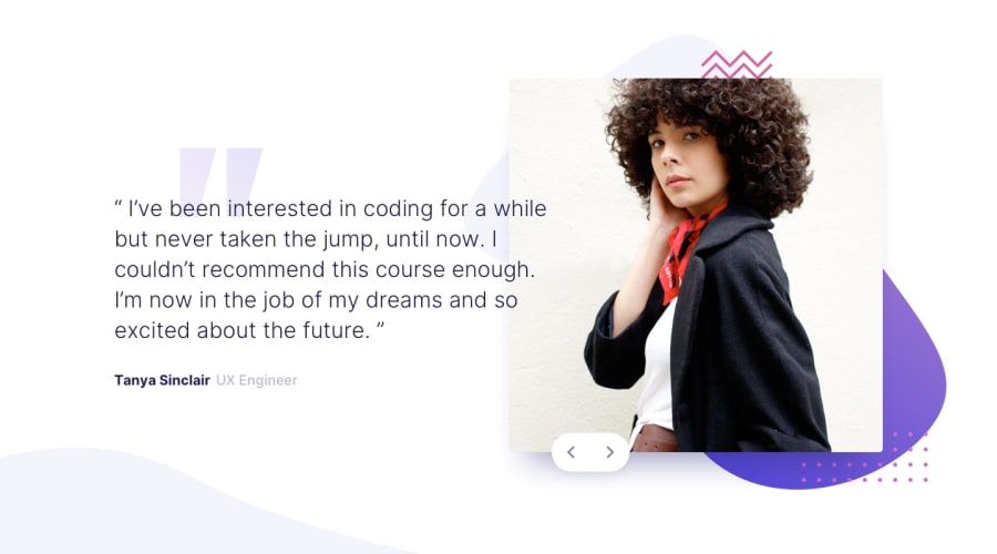
Coding bootcamp testimonials slider with only HTML CSS and JS
Design comparison
Solution retrospective
So, please, like and subscribe who also spent 2 hours of his life trying to understand why there is tiny gap between two buttons
p.s.: just put a comment between them in your html file, it can be empty or with some thoughts or feelings
Community feedback
- @atekronPosted over 3 years ago
thanks for commenting, it's by design this way, I wanted to give sliders some boundary, under the hood my code uses data organized into something like json and can work with arbitrary number of data entries
0 - @palgrammingPosted over 3 years ago
well it look good so far but I would make the buttons so you can endlessly rotate the pictures with button. Here is my solution with the buttons not sure if they way I did it will help to understand your issues or not https://palgramming.github.io/Frontend_Mentor_Challenges/coding_bootcamp_testimonials_slider/index.html
0
Please log in to post a comment
Log in with GitHubJoin our Discord community
Join thousands of Frontend Mentor community members taking the challenges, sharing resources, helping each other, and chatting about all things front-end!
Join our Discord
