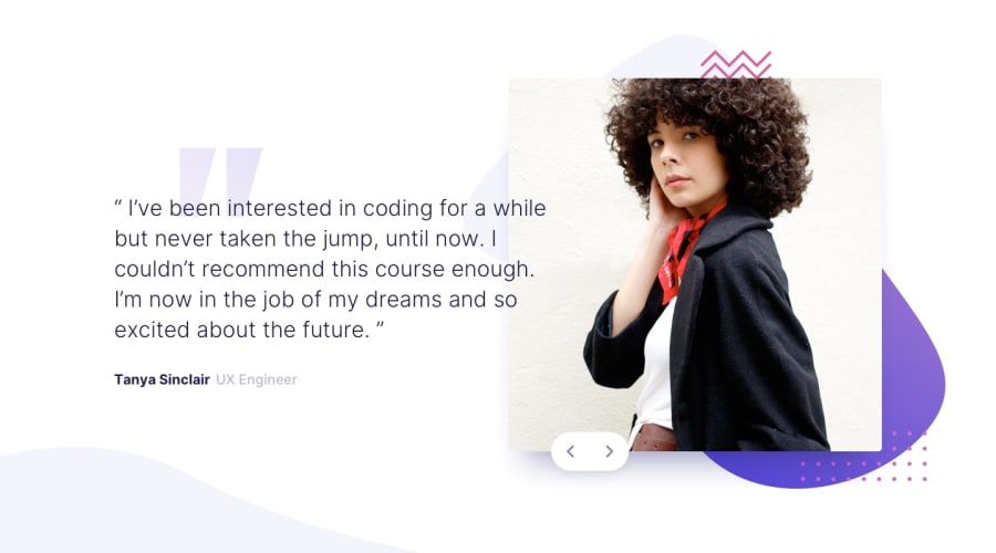
Coding Bootcamp Testimonials Slider Master Challenge
Design comparison
Solution retrospective
I appreciate any feedback or suggestions helping me to improve my next challenge. Feel free to leave a comment.
Community feedback
- @TedJenklerPosted 3 months ago
Hi @AbdelmonemMarei,
Nice project! I noticed a few things that could be improved:
Footer Issue: At the bottom of your page, the footer disrupts the flow of the design. I’d suggest making the footer background transparent and positioning it absolutely at the bottom. This way, the background will remain consistent and look great.
Mobile Experience: It seems you might not be using a mobile-first approach. On a 375px width phone, the site exceeds 100% width, which negatively impacts the phone experience. I recommend starting with a mobile-first approach, fixing issues as they arise, and then adjusting for larger screens. This method is often easier than designing for desktop first and trying to fix numerous CSS bugs for mobile later. Given that phones are the most widely used devices today, this approach is crucial.
I hope these suggestions was helpful
Best, Teodor
1@AbdelmonemMareiPosted 3 months ago@TedJenkler
Thank you for your feedback.
- For Footer I made like this suggestion in my pervious challenges .
- For Mobile First I didn't recognize that there are mobiles their screen width is less than 375px .
I appreciate your suggestions .
1
Please log in to post a comment
Log in with GitHubJoin our Discord community
Join thousands of Frontend Mentor community members taking the challenges, sharing resources, helping each other, and chatting about all things front-end!
Join our Discord
