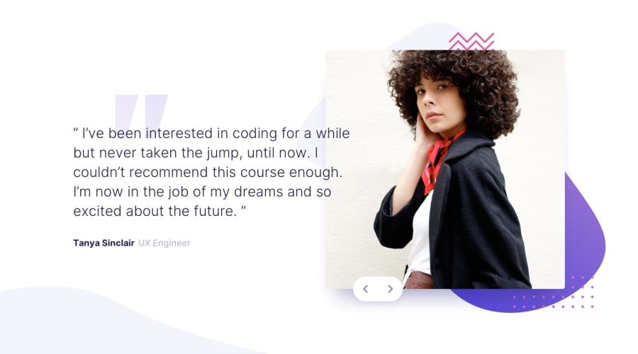
Design comparison
SolutionDesign
Solution retrospective
-
The solution doesn't look like the screenshot taken by frontendmentor.io AI for some reason, which is really disappointing !!
-
you can check the real solution from the Preview option.
-
Any feedback or suggestion would be appreciated.
Community feedback
- @MelvinAguilarPosted about 2 years ago
Hi @Shady-Omar 👋, good job for completing this challenge!
Your screenshot looks different with the design because you have not checked your solution in another browser, in the Firefox browser your design is broken
I suggest the following:
- Use
flex: 45%;in the.slide-one imgand.slide-two imgselectors. - Use
flex: 55%;in the.slide-two .textand.slide-one .textselectors.
I hope those tips will help you.
Good Job and happy coding !
Marked as helpful1 - Use
Please log in to post a comment
Log in with GitHubJoin our Discord community
Join thousands of Frontend Mentor community members taking the challenges, sharing resources, helping each other, and chatting about all things front-end!
Join our Discord
