Design comparison
Solution retrospective
Any feedbacks are appreciated
Community feedback
- @AgataLiberskaPosted almost 4 years ago
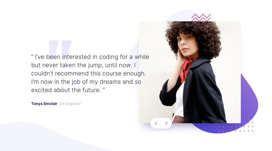
Hi @a331998513, well done here, the animations look great, although I'm not sure about the delay on page load - but that's just personal preference. A few issues I found:
-
I would add
cursor: pointerto the buttons to make it even clearer that it's something user can interact with -
There need to be some focus styles for the buttons - you removed the default outline which is only okay if you add an alternative to allow users to navigate your page with keyboard
-
On some screens (larger mobile and tabler), the attribution text is not centered.
-
The quote mark illustration in the background is should be positioned behind the text on mobile screen, I think :)
Hope this helps :)
0@JunjiequanPosted almost 4 years ago@AgataLiberska Thanks alot for pointing out the issues. I really appreciate that. gotta do some works on fixing out the problems ;)
0@AgataLiberskaPosted almost 4 years ago@a331998513 no worries, happy to help :)
0 -
Please log in to post a comment
Log in with GitHubJoin our Discord community
Join thousands of Frontend Mentor community members taking the challenges, sharing resources, helping each other, and chatting about all things front-end!
Join our Discord
