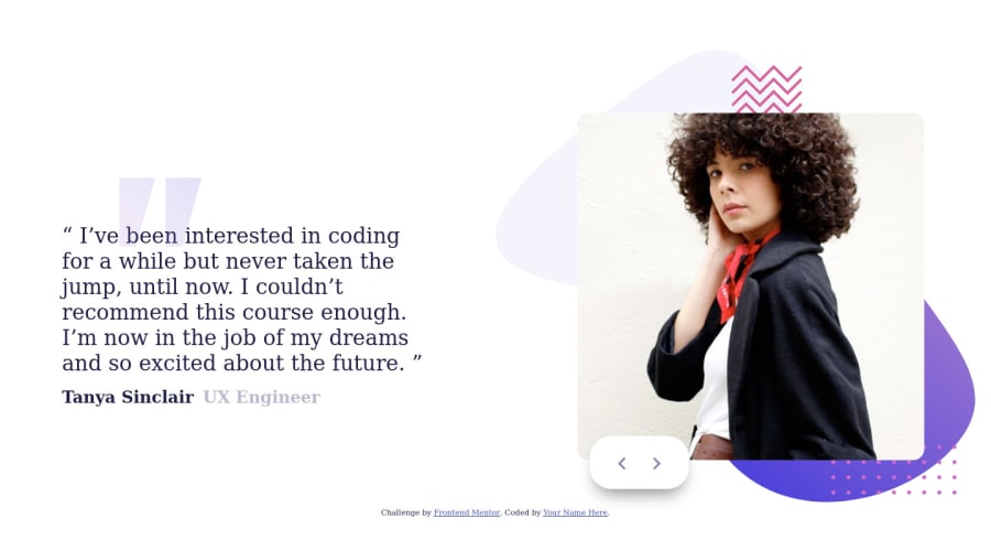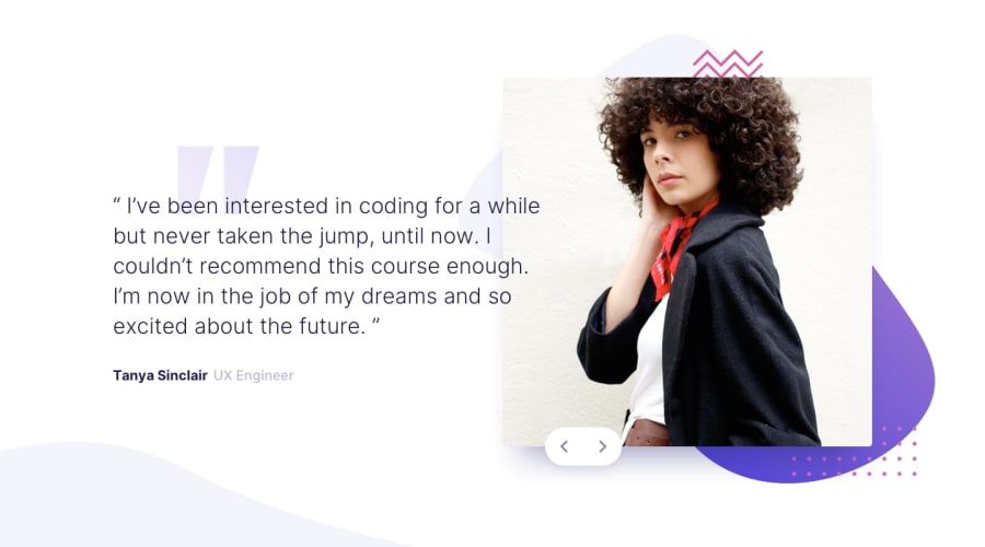
Design comparison
SolutionDesign
Solution retrospective
Please do point my mistakes. Thank you all
Community feedback
- @elidakirigoPosted almost 3 years ago
hi Emtiaz!
the attention to detail is quite on point!
nice!
I can suggest
- Reduce the blockquote font to 500 of font-weight to match the original design.
- Change the box shadow from the buttons to the profile image.
to reduce accecibility errors try putting all content on a main tag like <main> or <header> or <footer>
Marked as helpful0
Please log in to post a comment
Log in with GitHubJoin our Discord community
Join thousands of Frontend Mentor community members taking the challenges, sharing resources, helping each other, and chatting about all things front-end!
Join our Discord
