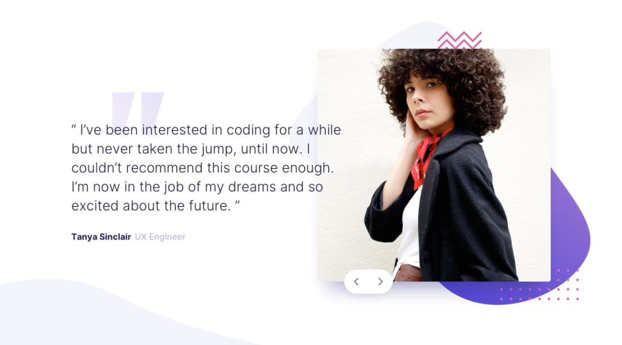
Design comparison
SolutionDesign
Solution retrospective
What are you most proud of, and what would you do differently next time?
There was a point where I had to write a calc() function to proportionally increase the padding of the image container to keep the image in place in large screen sizes. It took a while but I did it.
What challenges did you encounter, and how did you overcome them?I was not sure that arbitrary background-size and background-position could be set in TailwindCSS. I did some reading and spent some time to experiment with it. And finally, I was able to set it up.
What specific areas of your project would you like help with?I would like to get suggestions on the accessibility issues and semantic mark up. Any way to improve it?
Community feedback
Please log in to post a comment
Log in with GitHubJoin our Discord community
Join thousands of Frontend Mentor community members taking the challenges, sharing resources, helping each other, and chatting about all things front-end!
Join our Discord
