Submitted over 3 years ago
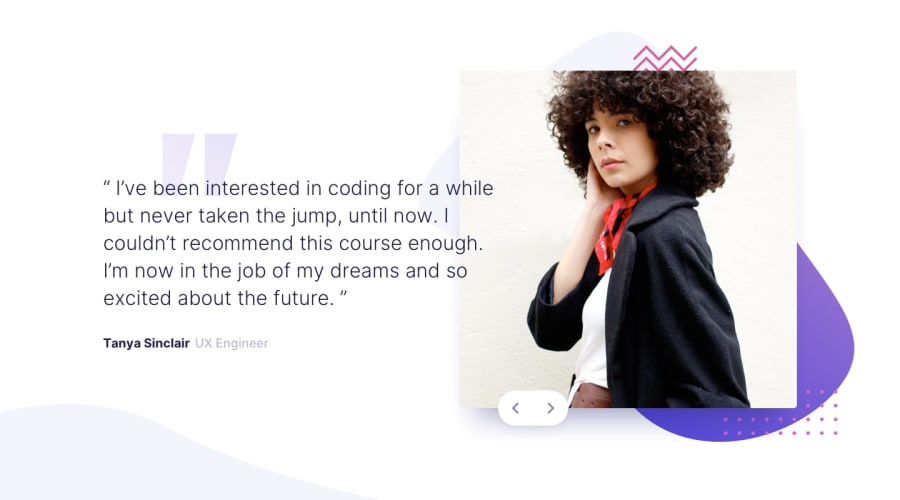
Coding Bootcamp Testimonials Slider
@analuzcervantes
Design comparison
SolutionDesign
Solution retrospective
Hello everyone, 🖖
Any comment is greatly appreciated. Let me know what you think. 👾
Happy coding! ❤
Community feedback
- @AgataLiberskaPosted over 3 years ago
Hi @analuzcervantes, well done, it looks great!
The only thing is the position of the buttons, on some screens they end up in the middle of the photos, or even covering the faces...
Another thing is that the buttons should really be buttons, not divs. The divs do the job for someone who uses a mouse, but they're not accessible to those who use keyboards to navigate - they would never be able to get to the next slide...
Hope this helps! :)
1
Please log in to post a comment
Log in with GitHubJoin our Discord community
Join thousands of Frontend Mentor community members taking the challenges, sharing resources, helping each other, and chatting about all things front-end!
Join our Discord
