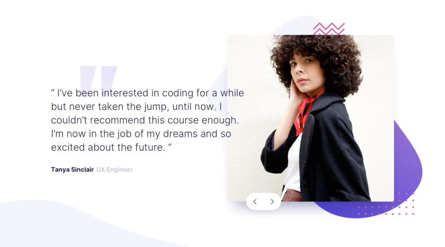
Design comparison
SolutionDesign
Community feedback
- @BMcdavittPosted almost 2 years ago
Nice Job! I like the animation on the image change.
I noticed that the navigation buttons tend to get misaligned in the mobile view, you may want to look into using a grid layout to keep these in sync instead of trying to use position absolute, it worked well for my solution
Marked as helpful0
Please log in to post a comment
Log in with GitHubJoin our Discord community
Join thousands of Frontend Mentor community members taking the challenges, sharing resources, helping each other, and chatting about all things front-end!
Join our Discord
