Design comparison
Solution retrospective
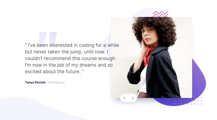
Hello everyone! I completed this challenge and it was not very easy, because I could not position elements without setting position to absolute. Can you guys give any feedback on this ! What should I study?! Happy coding!!!
Community feedback
- @visualdennissPosted over 1 year ago
Hey,
congrats on completing the challenge successfully! It looks great on desktop. But since you have positioned images absolute, relative to the body itself, it is not responsive. Instead you can try to use CSS Grid or flex to have a container for the left/right columns (left for text, right for imgs). Right box would then be container for the images, which you can set to position relative. Then you can position images absolute to that container. This way 'body' would be freed, because if there would be more elements on the page or sections on the page, it would make the layout pretty complex to handle. And position the buttons absolute to the that right container, as buttons are related to image container etc. and not the whole page.
So a good way to think about this is what relationship do the elements have to each other. Is gallery button in closer relationship with the image or the body itself? By answering this you can determine which parent should have position relative. In this case, buttons belong to images component and not the whole body itself.
Hope this was helpful! Good luck :)
Marked as helpful1
Please log in to post a comment
Log in with GitHubJoin our Discord community
Join thousands of Frontend Mentor community members taking the challenges, sharing resources, helping each other, and chatting about all things front-end!
Join our Discord
