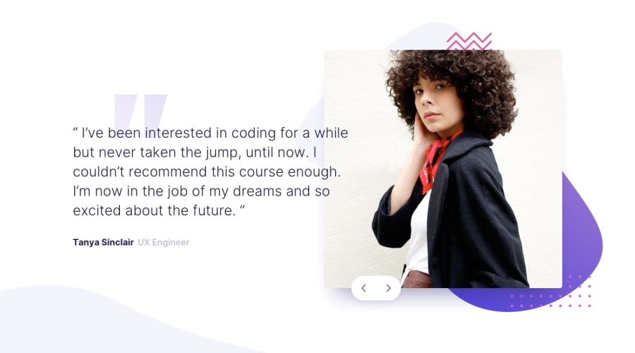
Design comparison
SolutionDesign
Solution retrospective
I appreciate feedback and/or thumbs up
Community feedback
- @ChanneasPosted over 4 years ago
Looks good. It doesn't seem like you used the curve.svg image however, which should be placed in the bottom left
Marked as helpful0
Please log in to post a comment
Log in with GitHubJoin our Discord community
Join thousands of Frontend Mentor community members taking the challenges, sharing resources, helping each other, and chatting about all things front-end!
Join our Discord
