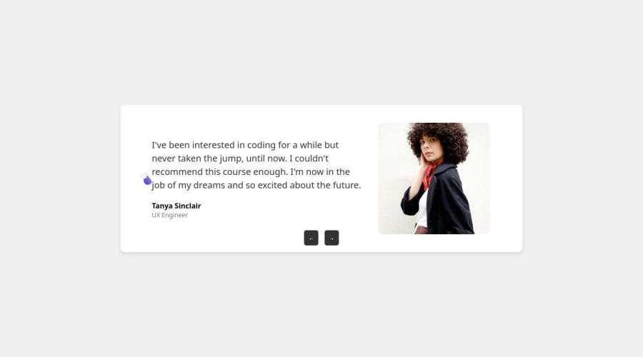


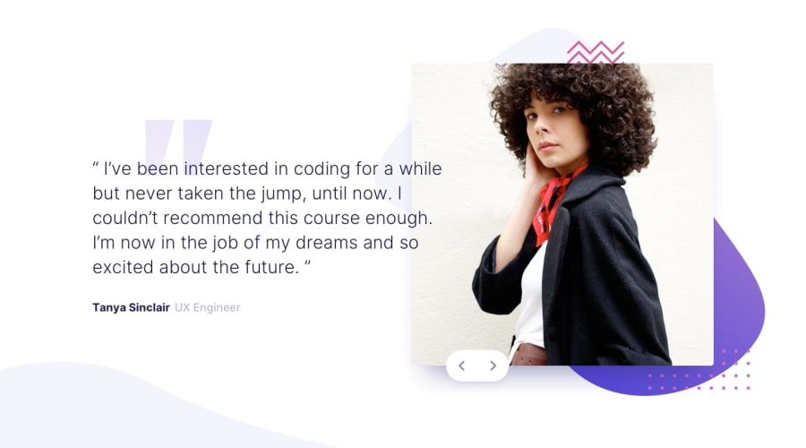
Design comparison
Solution retrospective
I am most proud that I successfully completed this challenge using only HTML and CSS. It helped me improve my understanding of structuring a webpage and styling it to match the given design. Next time, I would focus on making my code more efficient by using CSS flexbox/grid more effectively and ensuring better responsiveness for different screen sizes.
What challenges did you encounter, and how did you overcome them?One of the challenges I faced was aligning the elements perfectly according to the design. Initially, some sections were not positioned correctly, but I resolved this by carefully adjusting margins, paddings, and using flexbox. Another challenge was ensuring that the text and images were responsive. I overcame this by using relative units like percentages and rem instead of fixed pixel values.
What specific areas of your project would you like help with?This project helped me strengthen my CSS skills, especially in layout techniques like grid and flexbox. I also learned the importance of attention to detail when recreating a design. Additionally, I realized how crucial it is to test the design on different screen sizes to ensure responsiveness.
Please log in to post a comment
Log in with GitHubCommunity feedback
- @asia272
Hey Saima Ahmed Sial,
You're doing a great job! Your design looks amazing, but making it more responsive will help match the required design even better. Here are a few suggestions:
📱 Make .testimonial-container responsive:
Use media queries to set
flex-direction: column-reverse;gap: 2rem;on smaller screens to match the design requirements.Apply
text-align: center;to.testimonial-containerso the text inside aligns correctly according to the design.📏 Use flexible units instead of
px:Instead of using fixed
pxvalues, switch toremor%to ensure better scalability across different screen sizes. 🎯 Improve padding & width for mobile:Reduce
.testimonial-containerpadding to1remon mobile for better spacing.Remove width:
60%from.testimonialin mobile view using a media query to match the design requirements.🚀 Keep up the great work! Happy coding! 😊

Join our Discord community
Join thousands of Frontend Mentor community members taking the challenges, sharing resources, helping each other, and chatting about all things front-end!
Join our Discord