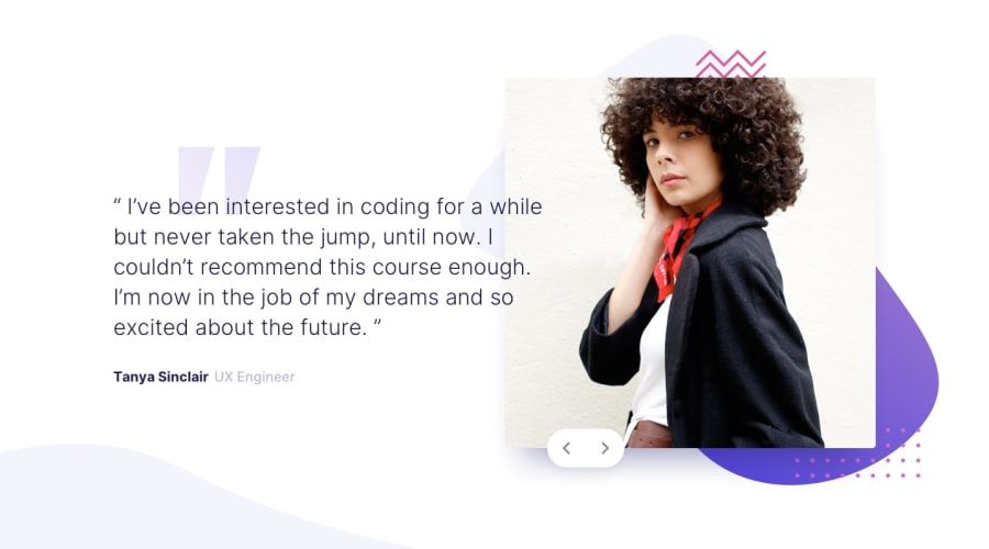
Design comparison
SolutionDesign
Solution retrospective
any feed back is welcome
Community feedback
- @FluffyKasPosted over 2 years ago
Hey, great job on this one! I'd suggest you use
max-width(something around 1500px would work well) on your container though so it doesn't stretch out too much as the screen gets wider! Other than this, well done ^^1
Please log in to post a comment
Log in with GitHubJoin our Discord community
Join thousands of Frontend Mentor community members taking the challenges, sharing resources, helping each other, and chatting about all things front-end!
Join our Discord
