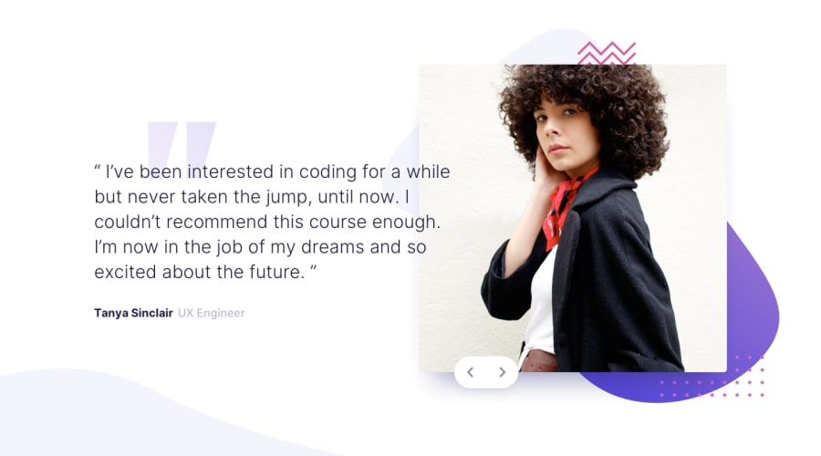
Design comparison
SolutionDesign
Solution retrospective
What are you most proud of, and what would you do differently next time?
I am proud of my JavaScript code
What challenges did you encounter, and how did you overcome them?I encountered many challanges.
- The background image. I couldn't align where it was supposed to be.
- responsivness. I couldn't make it responsive when the screen is les than 600 px it just breaks the screena and the content is shrinking more I used flex-shrink but it didn't work. So please anyone explain and help me.
Other than that I have no questions. Please give me feedbacka as suggestions to how can I write code better in the future. Also Tell me more about my mistakes, So I can improve my skills and get better at writing code. Thanks!
Community feedback
Please log in to post a comment
Log in with GitHubJoin our Discord community
Join thousands of Frontend Mentor community members taking the challenges, sharing resources, helping each other, and chatting about all things front-end!
Join our Discord
