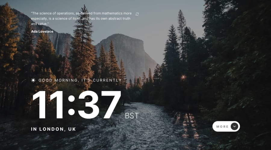
Design comparison
Solution retrospective
My first project on this site!
Community feedback
- Account deleted
Hello there! 👋
Congratulations on finishing your challenge! 🎉
I have some feedback on this solution:
- Always Use Semantic HTML instead of
divlike<main><header>, etc for more info.
if my solution has helped you do not forget to mark this as helpful!
Marked as helpful1 - Always Use Semantic HTML instead of
- @a-maystorovPosted almost 3 years ago
Hello 👋,
amazing job on your first project here, everything seems to function properly other than the greeting message. For me it is displaying Good Evening, but should be Good Afternoon.
I would have another look at the logic there and I would suggest working on the layout for different sceen sizes a little bit more, space out the clock and more/less button elements towards the center during the open state.
Other than that if you want to use this for your portfolio I would make the transitions smoother and less overlapping just to make it more pleasing for the eyes.
Keep up the good work! 🔥💯
0
Please log in to post a comment
Log in with GitHubJoin our Discord community
Join thousands of Frontend Mentor community members taking the challenges, sharing resources, helping each other, and chatting about all things front-end!
Join our Discord
