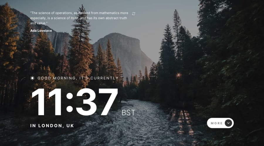
Design comparison
Solution retrospective
Hello everyone,
I've decided to create this project with a mobile-first approach and as a Progressive Web App (PWA). For layout, I was using Flexbox and CSS Grid with semantic HTML markup and CSS custom properties.
I would like to hear your feedback because there is always room for improvement.
Community feedback
- @B1N4R1Posted over 3 years ago
Hey Dusan!
First of all, awesome solution to the challenge I love it.
Just one thing to say, when you click the "more/less" button, I like how the "div.more" animates and slides in but It would a lot cooler if you could do that when it slides down too.
I just find it distracting when it disappears all of a sudden, know what I mean?
It would be the same for the clock part, "div.time" I think it's called. I would make it go along with the animation of "div.more".
Anyway the solution is great, I can see it's responsive and all so definitely dropping a like!
Great work!
2@DEmanderbagPosted over 3 years ago@B1N4R1 thank you for the comment. Yes, I absolutely agree with your suggestion the animation is not consistent and that should be improved soon.
Thanks ^^
0
Please log in to post a comment
Log in with GitHubJoin our Discord community
Join thousands of Frontend Mentor community members taking the challenges, sharing resources, helping each other, and chatting about all things front-end!
Join our Discord
