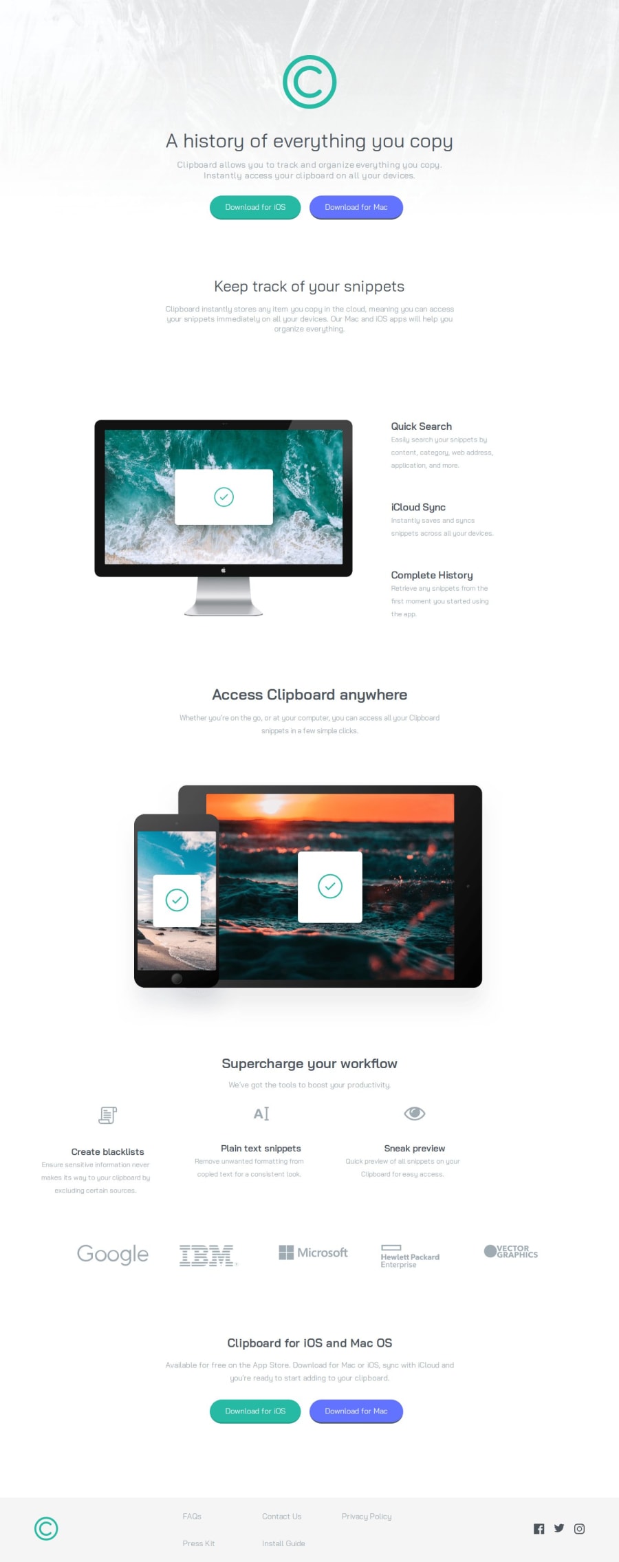
Design comparison
Solution retrospective
I used Figma to guide me with pixels, but it didn't work out well. I am having difficulties with using media queries and with text centering. I couldn't apply the effect of changing the color of the image on HOVER. If you have any tips for any of the difficulties above or anything else that I can improve, feel free to comment on it.
I used the "Responsive View" extension and checked all the resolutions it provides, and none of them had this error shown in the screenshot. If you know why this is happening, please help me.
Please log in to post a comment
Log in with GitHubCommunity feedback
No feedback yet. Be the first to give feedback on Alysson Demari's solution.
Join our Discord community
Join thousands of Frontend Mentor community members taking the challenges, sharing resources, helping each other, and chatting about all things front-end!
Join our Discord
