Submitted almost 2 years ago
Clipboard-landing-page-responsive-with-flexbox
@Bthedraft
Design comparison
SolutionDesign
Solution retrospective
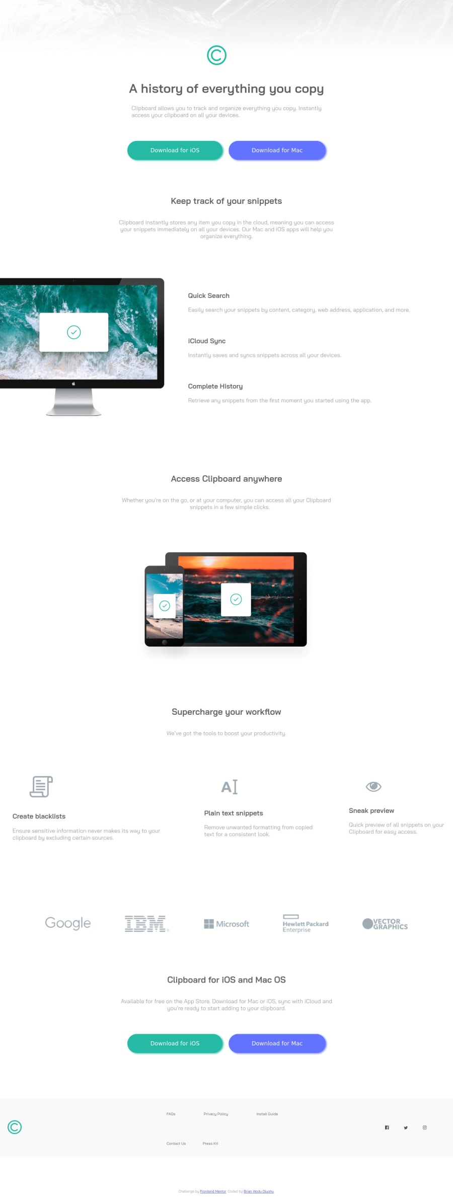
Hi there 👋, I’m Brian and this is my solution for this challenge. 🚀 Any suggestions on how I can improve and reduce unnecessary code are appreciated!
Thank you. 😊✌️
Community feedback
- @vanzasetiaPosted almost 2 years ago
Hi, Brian! 👋
There are a few changes you can do to make this solution better.
- Don't use
<picture>element for the logo. Use<picture>element when there is many versions of the same image. - Remove all
<br>elements. Screen readers may read out<br>elements as "break" and not read the content within<br>s. Let lines wrap where they need to. - Use
<a>withdownloadattribute for each download button. - Not every image needs alternative text. Decorative images should not have alternative text (
alt=""). This will tell the screen reader to skip over the image. As a result, it saves screen reader users time navigating the page. - For your information, decorative images are images that don't add any information and serve only aesthetic purposes.
- If the logo is wrapped by an anchor tag, the alternative text of the image should tell the destination of the link. Usually, the destination will be the home page. So, the alternative text of the logo should be "Clipboard - Home".
- Don't change the
<html>or the:rootfont size. It can cause huge accessibility implications for those users with different font sizes or zoom requirements. - Use a CSS reset whenever you start a new project. This can help you set the styling foundation easily. My recommendation — A Modern CSS Reset
I hope you find this useful. 🙂
0 - Don't use
Please log in to post a comment
Log in with GitHubJoin our Discord community
Join thousands of Frontend Mentor community members taking the challenges, sharing resources, helping each other, and chatting about all things front-end!
Join our Discord
