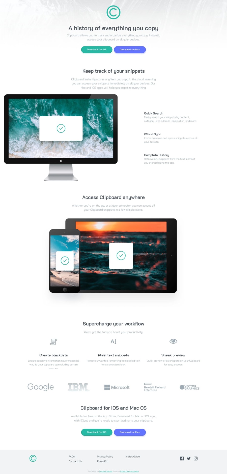
Clipboard-landing-page-master using web components
Design comparison
Solution retrospective
Hello, I would like feedback, if there are something I can improve.
Thanks!
Community feedback
- @K01wfdPosted about 1 year ago
Hi @rafaeldgeo, my suggestions for your solution:
- Avoid using inline-styling, it will make the project unreadable and messy (my opinion).
- For this solution, icrease the vertical spacing between each section components, i would use margins for spacing components in each section, and padding for main wrapper for each section.
- simple reset for images would make them easier to work with:
display:block; max-width:100%;
Thanks.
Marked as helpful0@rafaeldgeoPosted about 1 year ago@Korg01wfd Hi! Thank you for help!
I agree with you about use inline-styling, but I used the web component to create custom tag HTML from Javascript. This resource allow you to create reusable custom element. I'm learning to use this suite, before learing React;
If you look at my challenge "Testimonials grid section", you will look custom tag HTML. The HTML code is very small, because almost everything was made in JS.
Congratulation for your challenges! Let's practice! Our journey is long!
0@K01wfdPosted about 1 year ago@rafaeldgeo my pleasure, yeah i can see that third party libraries follow this approach, this was helpfull thanks.
0
Please log in to post a comment
Log in with GitHubJoin our Discord community
Join thousands of Frontend Mentor community members taking the challenges, sharing resources, helping each other, and chatting about all things front-end!
Join our Discord
