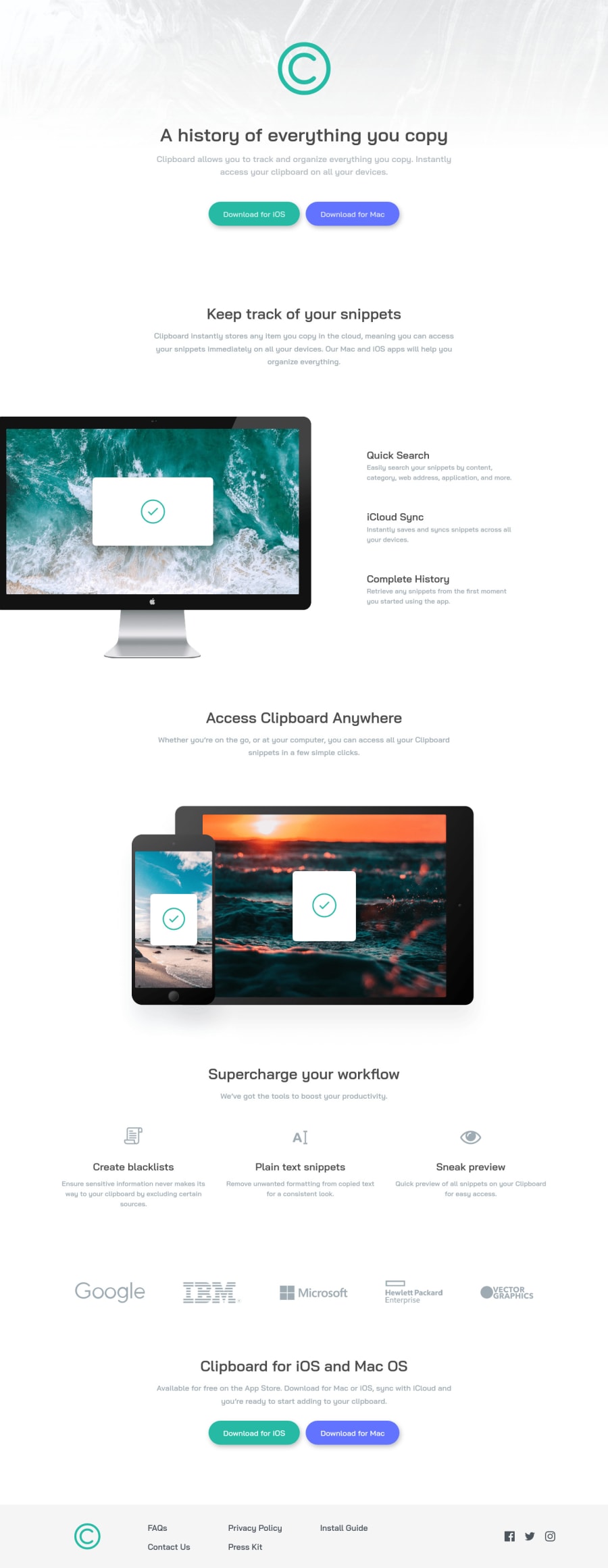
Design comparison
Solution retrospective
Finally i complete this challenge 😁👌👌from frontend mentor & my Second SASS/SCSS project. Using CSS-FlexBox, But SASS powers and method very usefull this project like : Mixing, variables, extend, partails And one of the best SASS feature is Nesting😁😉
#sass #scss #100DaysOfCode
Community feedback
- @shashreesamuelPosted about 3 years ago
Good job with this challenge, keep up the good work
In terms of your html validation issue consider using heading tags like
h2-h6to identify sections or just wrap within a<main>I hope this helps.
Cheers, Happy coding 👍
0 - @ChamuMutezvaPosted about 3 years ago
Greetings Dev
Well done, the site looks good and is responsive. Here are a few things that you can have a look at:
- the ios and mac buttons, if they navigate to the respective downloads site, then they should be anchor elements.
- alt values should be descriptive for the benefit of assistive technology users, one word values like
preview, blacklist , plain textetc are not good enough in my opinion. Users should be able to visualize the message that is being put across from the image. If they are decorative images then use empty alt values. FAQS, Install guide, Contact us, Press Kit, etcshould have anchor elements - they are links to sections or pages related to those topics.
0
Please log in to post a comment
Log in with GitHubJoin our Discord community
Join thousands of Frontend Mentor community members taking the challenges, sharing resources, helping each other, and chatting about all things front-end!
Join our Discord
