Design comparison
Solution retrospective
Hi, guys just finished this project, please provide any feedback for my improvement.
Community feedback
- @pikapikamartPosted almost 3 years ago
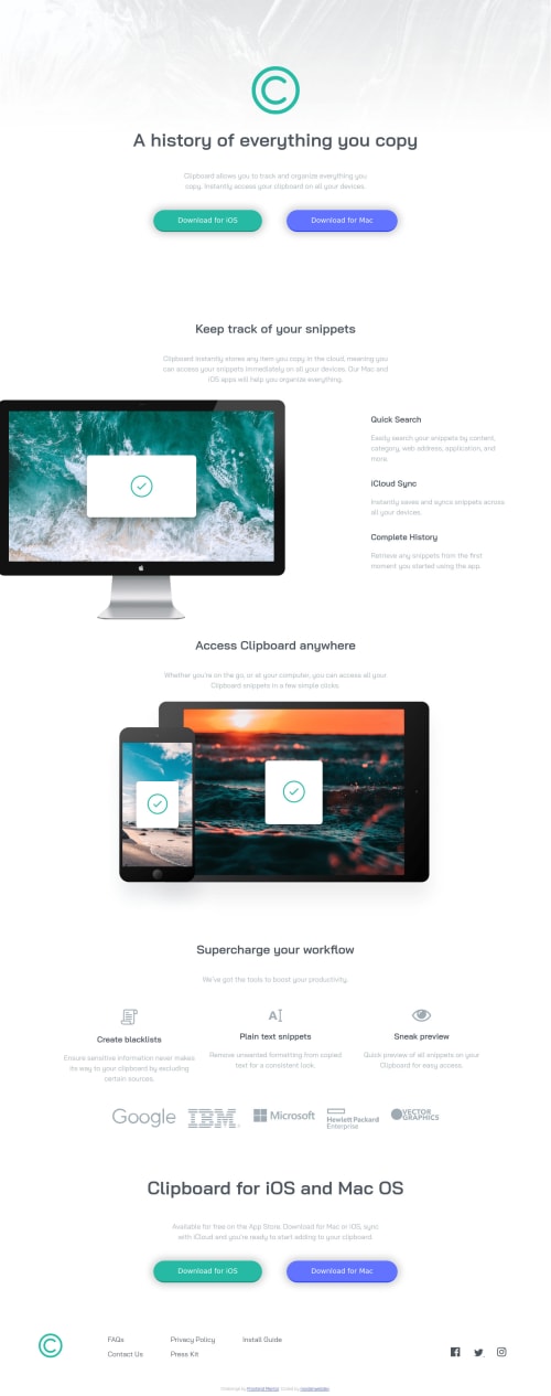
Hey, awesome work on this one. Desktop layout looks great, the site is responsive just a quick suggestion, on size 541px above there are appears a horizontal scrollbar on the site and on the
keep track of your....
section, you could already show the mobile state at the point so that the layout on that part won't be tall ( talking about the right-side content). Mobile state looks great.David Turner already gave feedback on this one, just going to add some suggestions as well:
- It would be nice to add a
max-width
on thebody
tag. If you zoom out from your screen, you will see that the content of the site just stretches along with the screen-size. Adding themax-width
will prevent that and will make the layout more consistent. - For this one, I don't really know if you need to use the
header
because the site-logo is the only content that is suited on it on this layout. - Remember that a website-logo is one of the meaningful images on a site so use proper
alt
for it. Use the website's name as the value likealt="clipboard"
. - Like what I said before, using words that relates to "graphic" should not be used inside the
alt
since theimg
is already an image. Remove those words like "logo" and other text if there are. - The desktop image could use a more meaning
alt
since computer is too broad, it could be like `alt="clipboard app running in desktop". - Same for the tablet and mobile-phone, use a more meaningful
alt
. - Those 3 icons after the
Supercharge your workflow
section are just decorative images and should be hidden for screen-reader users by usingalt=""
andaria-hidden="true"
to theimg
tag. - Use only the company's name as the
alt
value and remove theimage
word on it. - Change the
h1
usage from thecta
section part to use onlyh2
so thath1
won't be redundant.
FOOTER
- The
background-color
on thefooter
selector is missing. You should add so that there will be contrast and just distinction on where thefooter
is located or occupying. - Include the
.attribution
inside thefooter
tag so that it will be inside a landmark element. - Same with the company logo, use a more proper
alt
value. - Those 5 links could be inside a single
ul
since those are related list items. Usegrid
to place each item properly and you could nest theul
inside of annav
element since those are still your site's navigational links. Lastly, usea
tag for each since they are supposed links. - Those social-media links could be inside a
ul
element since those are "list" of links. - Social-media image should be hidden since it is only a decorative image so use
alt=""
andaria-hidden="true"
.
Aside from those, great job again on this one.
Marked as helpful0 - It would be nice to add a
- @brodiewebdtPosted almost 3 years ago
This is very good. You did forget to add the background color to the footer.
Hope this helps.
Marked as helpful0
Please log in to post a comment
Log in with GitHubJoin our Discord community
Join thousands of Frontend Mentor community members taking the challenges, sharing resources, helping each other, and chatting about all things front-end!
Join our Discord