Design comparison
Solution retrospective
I would be happy to see your feedback about my project and tell your opinion about my code
Community feedback
- @BonreyPosted over 3 years ago
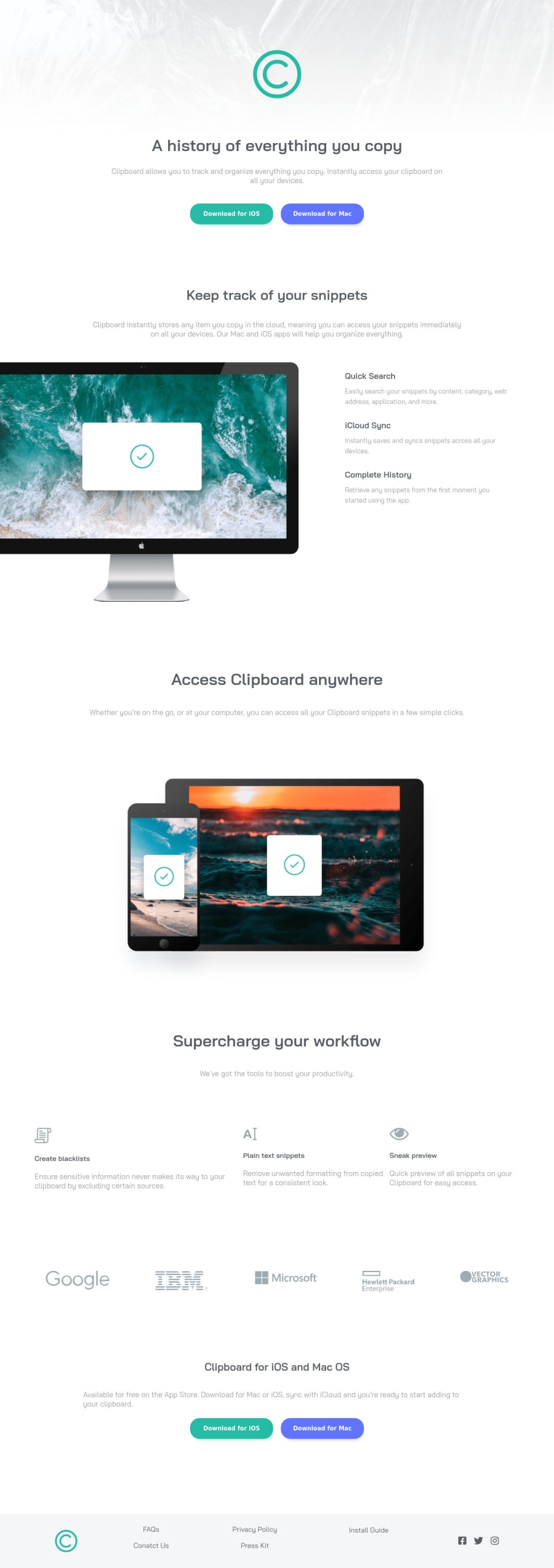
Hi, Muhammad! Your site is quite notable! I especially liked the desktop version: it is very close to the original. 😃
There're a few little things you might want to fix, though. All of them are about your mobile version. Let's go from the top to the bottom:
- Your site logo isn't clickable. It'd be a good idea to make the page refresh or scroll to the top when you click it.
- There is no padding around your paragraphs and headings on smaller devices, which results in a poor user experience. We all don't like it when the text sticks to the sides, do we? 🙃
- The Supercharge your workflow section isn't centered, and the headings with icons get skewed to the left. 😟
- Finally, company labels are arranged in a row instead of a column, and therefore, they look somewhat small on mobile devices.
All of the above are easy fixes. But they're worth doing, IMHO. 🙂
As for your code, I suggest you make more meaningful class names. For example,
workflow-sectioninstead ofsection2. It may take you some time to come up with those names, but you'll be able to quickly grasp what each section was about if you decide to return to your code after some time. 👨💻By the way, I saw in your profile that you're just 18 y.o. I think it's commendable that you're creating such complex projects at this young age! 💪 Keep on practicing! I wish you all the best! 😃
Marked as helpful2@Muhammad-samirPosted over 3 years ago@Bonrey Thanks so much for your advice and I'm going to fix it as fast as I can
0
Please log in to post a comment
Log in with GitHubJoin our Discord community
Join thousands of Frontend Mentor community members taking the challenges, sharing resources, helping each other, and chatting about all things front-end!
Join our Discord
