Clipboard-landing-page /HTML, CSS, Flex, Mobile first workflow
Design comparison
Solution retrospective
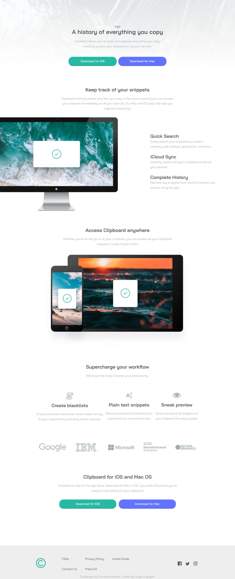
Please help! in workflow section, I have a flex container for the flex-looking content columns, but somehow the contents inside 3 flex items are not correctly aligned. Any help/hints would be greatly appeciated!
Community feedback
- @MojtabaMosaviPosted almost 3 years ago
Regarding you query:
I not sure if i understand you're question correctly, it would help a great deal if you describe the desired outcome that you're trying to accomplish.
If you're mean not flex-items don't have eaqual width by "not correctly aligned", there are different ways of making that happen. The first item is taking more space that the two other because it's has more content.
- By explicitly telling flex container how you want to distribute the space between flex item:
.container{ justify-content:center; } .container > * { flex:1; }- By giving each flex-item a max-width:
.container{
justify-content:space-between;
 }

.container > * {
     max-width: value
}
Keep coding :=)
Marked as helpful0@Duyen-codesPosted almost 3 years ago@MojtabaMosavi Hey! thanks for your help. The desire outcome could be that the content inside all 3 flex items, which includes 1 icon, h3 heading and a paragraph, would be in the same line.
0
Please log in to post a comment
Log in with GitHubJoin our Discord community
Join thousands of Frontend Mentor community members taking the challenges, sharing resources, helping each other, and chatting about all things front-end!
Join our Discord
