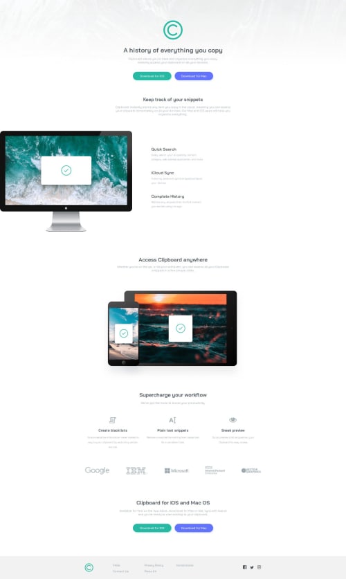
Clipboard-Landing-Page

Solution retrospective
I realized when doing this project there is a lot to learn when it comes to semantics, and the way you put together a site. This wasn't so much about getting the code perfect, but more putting the site together, making it work, and then learning ways to change aspects to make it easier, and more proper. I also realized now I forgot to add alt's to all the images. But there are various aspects to this project I know need changing, but overall I'm happy with what I have learned in putting this together, and am looking forward to being able to incorporate new ways in the future to make a smoother experience.
What specific areas of your project would you like help with?I wasn't able to properly know how to do media queries yet and optimize for different screen sizes. Still learning on that. Hoping for future projects i have no issues at all after i start learning more about it.
Please log in to post a comment
Log in with GitHubCommunity feedback
No feedback yet. Be the first to give feedback on Nathan B's solution.
Join our Discord community
Join thousands of Frontend Mentor community members taking the challenges, sharing resources, helping each other, and chatting about all things front-end!
Join our Discord