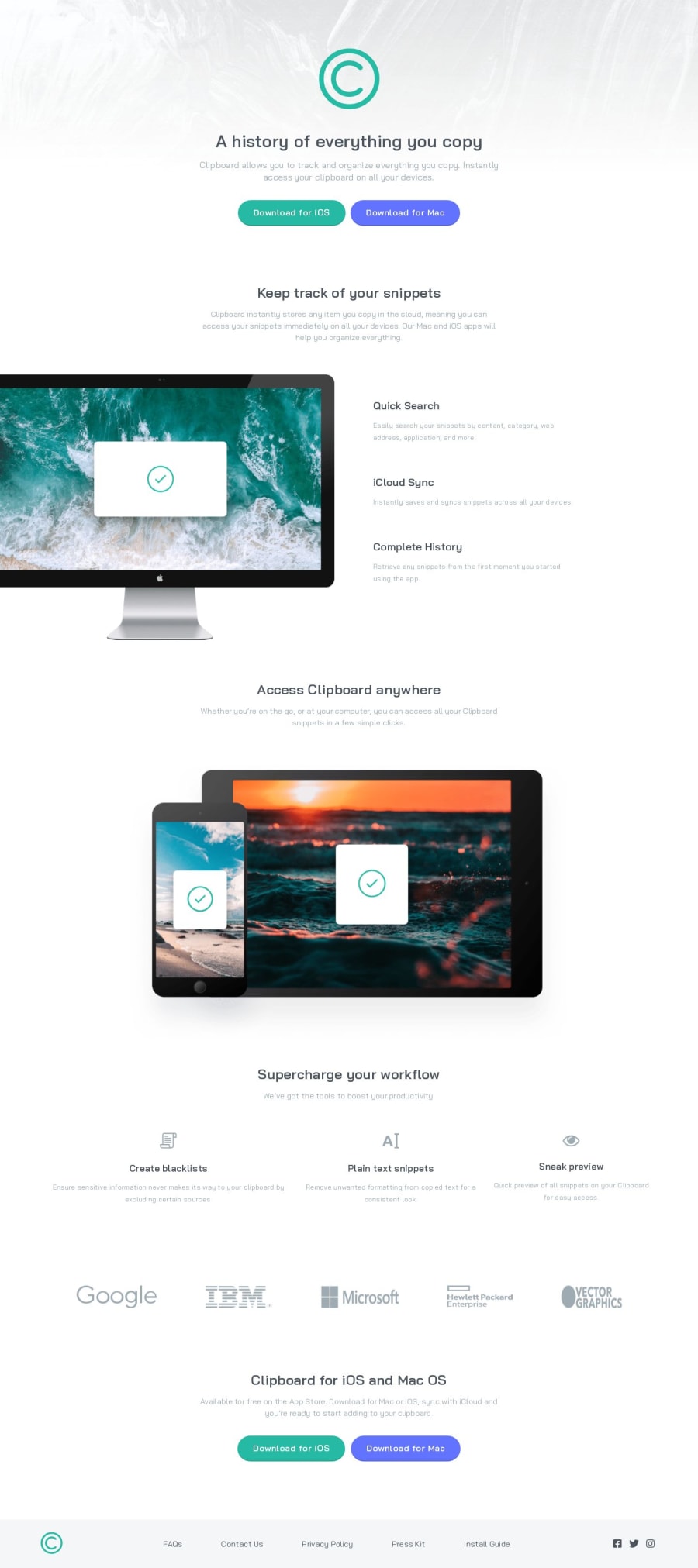
Design comparison
SolutionDesign
Solution retrospective
Your feedbacks are welcome ^^
Community feedback
- @vanzasetiaPosted over 1 year ago
Hi, Eman Negm! 👋
I have some feedback on improving your solution:
- Invalid HTML: Just use anchor tags for the download buttons. The button element must not be a child element of the anchor tag. Also, the anchor tag should not be the child element of the button element.
- Links and buttons: For your information, anchor tags are for navigation. The
<button>element is for an action like opening a modal, submitting a form, toggling an element, etc. It is essential to use the correct elements. - Readable alternative text: Alternative text should not be hyphenated.
- Meaningful alternative text: Alternative text for the logo should not be "logo". It should be the name of the logo—"Clipboard".
- Decorative images should not have alternative text: Not every image needs alternative text. This will tell the screen reader to skip over the decorative images. As a result, it saves screen reader users time navigating the page. For your information, decorative images are images that do not add any information and serve only aesthetic purposes.
I hope this helps. Happy coding! 🙂
Marked as helpful1@eman289Posted over 1 year agoThank you so much I didn't know about it that was very helpful <3 @vanzasetia
0
Please log in to post a comment
Log in with GitHubJoin our Discord community
Join thousands of Frontend Mentor community members taking the challenges, sharing resources, helping each other, and chatting about all things front-end!
Join our Discord
