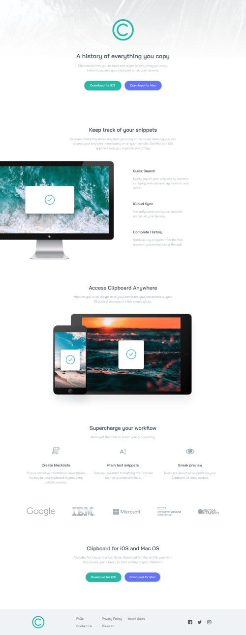
Design comparison
Solution retrospective
Hi everyone! This is my first time using Sass, I would appreciate any helpful tips or advice that anyone could share.
Community feedback
- @superpooperxxxPosted almost 2 years ago
Hey, good job on making this task🔥
I don't see any problems with footer, it is at the bottom of the page already. Maybe I didn't get the question.
Quick tips
- As I see you are using BEM. I highly recommend creating separate file for each BEM block (_header.scss, _about.scss etc) and put them in components folder. This will look more professional
Happy coding❤️ Hope this was helpful
Marked as helpful1@adityaphasuPosted almost 2 years ago@superpooperxxx OH! I was thinking the same thing for the folder structure and as for the footer thing, it's just that as you can see from the screenshot the footer isn't really at the bottom it's more like at the end of the content in the main. I'm guessing that the reason there's some white space at the end
0@superpooperxxxPosted almost 2 years ago@adityaphasu don't worry about screenshot, the problem is not in the footer. You have different margins, font sizes, that's why pages look different
0@adityaphasuPosted almost 2 years ago@superpooperxxx ah that's why, I was worried that I might be doing something wrong haha! Thanks a lot for clarifying my doubts 🙂
0
Please log in to post a comment
Log in with GitHubJoin our Discord community
Join thousands of Frontend Mentor community members taking the challenges, sharing resources, helping each other, and chatting about all things front-end!
Join our Discord