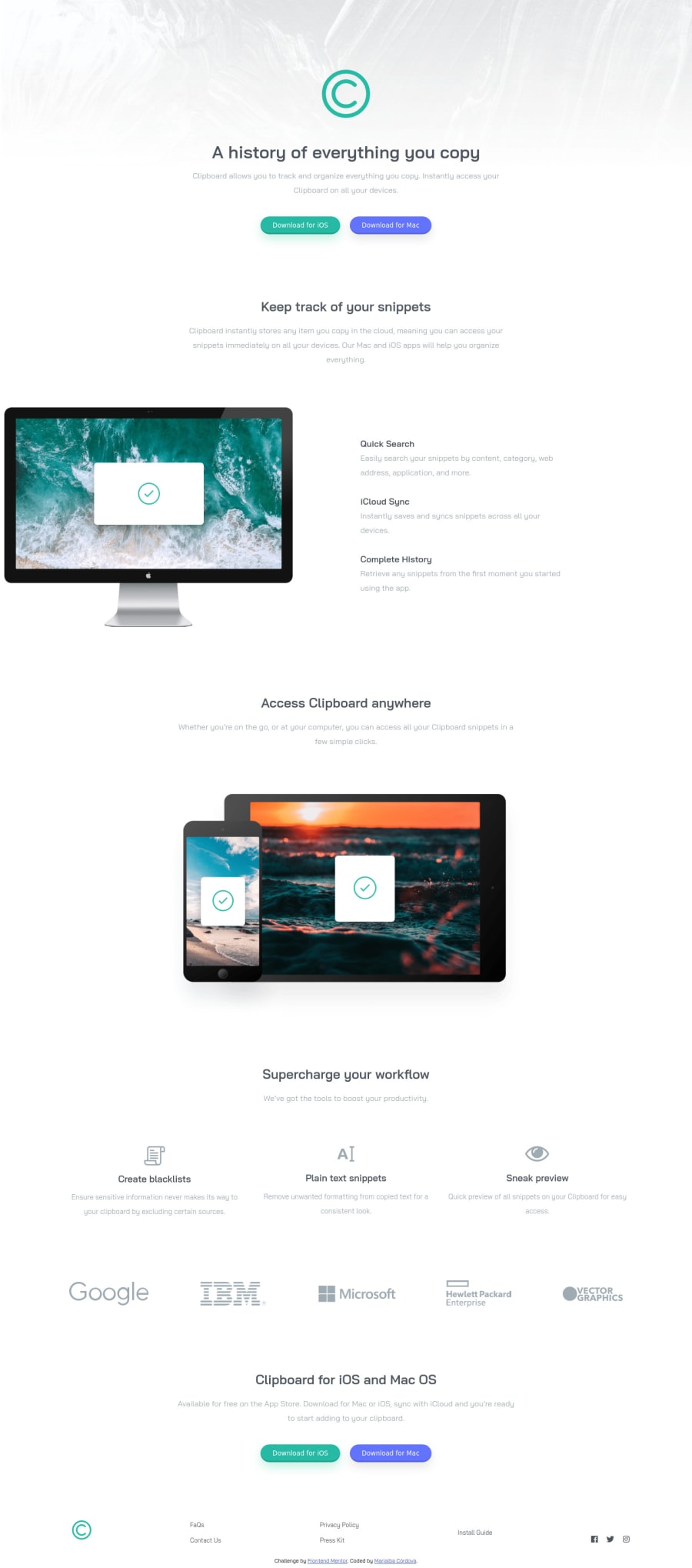
Design comparison
Solution retrospective
Hi guys! I would like to know your opinion regarding my code, I would appreciate it very much since I am new to this.
Community feedback
- @pikapikamartPosted about 3 years ago
Hey, great work on this one. The layout in desktop is very good, however the responsiveness could be a lot better, there are sections which are being hidden, contents being squeezed and some overlapping one another. On mobile state however, it looks good.
Some suggestions would be:
- The
alt
text for the website logo in theheader
could have used onlyalt="clipboard"
. Avoid adding words that relates to "graphic" like "image, picture, icon, logo", assistive tech will handle those for you. - The
alt
text for the different company should use their names as thealt
value, likealt="google"
on the googleimg
. - On the
footer
you are missing thebackground-color
like on the original, adding that would be really great so that there will be some sort of color divider and not just all pure white. footer
website logo could use as wellalt="clipboard"
.- The links in the
footer
section are missing their visual indicator in the:focus-visible
state. Either having aoutline
border
orbox-shadow
would be really great. - The links as well in the
footer
could be wrapped inside aul
element, so that screen reader users will know how many links there, since screen reader will announce how many items are there inside a list. - The social media links should be wrapped inside
a
tag since those are links, better usinga
tag. They could also be wrapped inside aul
element. Adding as well thearia-label
for eacha
tag that will wrap them. Anaria-label
is a piece of text that screen reader will say if they encounter that element. Since there are no text in the social media link right, a screen reader can't say anything, but when anaria-label
is associated on them, they will say that text. Example, thea
tag that will wrap the facebook icon would have:
<a aria-label="facebook"> icon of the facebook </a>
This will make your website more accessible.
- Lastly, try to solve the responsive issue that has been state above. Always inspect you layout in dev tools, change the screen size, test if the elements are correct and in proper place.
Aside from those, this is really great. The structuring is fine, just for those links right.
Marked as helpful1@Marialba16Posted about 3 years ago@pikamart Totally grateful for your comment, the truth will help me a lot and I hope it will help me improve. I will consider your advice. Thanks for reviewing it and I'll be improving it.
Thank you Raymart.
0 - The
- @ChamuMutezvaPosted about 3 years ago
The narration by @Raymart Pamplona is awesome , use dev tools and check your site between 451px and 800px . So far so good, just one more push.
Marked as helpful0@Marialba16Posted about 3 years ago@ChamuMutezva Totally agree Chamu!. Sure, thank you very much also for your comment.
0
Please log in to post a comment
Log in with GitHubJoin our Discord community
Join thousands of Frontend Mentor community members taking the challenges, sharing resources, helping each other, and chatting about all things front-end!
Join our Discord